Plot Snippets for Exploratory (and some Explanatory) Analyses
Foreword
- Output options: the ‘tango’ syntax and the ‘readable’ theme.
- Code snippets and results.
- Some data might necessitate more specialized packages.
- For explaining data, presenting results, reporting and publishing, we can generate prettier graphics with
ggvisorggplot2, and interactive packages such asshiny.
Plotting Packages
Graphics:
mapsfor grids and mapping.diagramfor flow charts.plotrixfor ternary, polar plots.gplots.pixmap,png,rtiff,ReadImages,EBImage,RImageJ.leaflet.
Grid:
vcdfor mosaic, ternary plots.grImportfor vectors.ggplot2and extensions.latticeandlatticeExtra.gridBase.
Devices:
JavaGD.Cairo.tikzDevice.
Interactive:
rgl.ggvis.iplots.rggobi.
Others:
ashfor density plots.clusterfor dendrograms.copulafor multivariate analyses.corrplotfor correlations.compositionsfor geometries, ternary plots.extracatfor missing values.soiltexturefor ternary plots and more.KernSmoothfor histograms-density plots.openairfor polar, circular plots.smfor density plots.carfor scatter plots.vioplotfor boxplots.vcdfor mosaic plots and multivariate analyses.hexbinfor scatter plots.scatterplot3dfor 3D scatter plots.clusterfor dendrograms.shinyfor interactive plots.ggvis.
Data Type & Dataset
Data Types
- continuous vs categorical (or discrete).
- continuous: float, x-y-z, 3D, map coordinates, trianguar, lat-long, polar, degree-distance, angle-vector.
- categorical: integer, binary, dichotomic, dummy, factor, ordinal (ordered).
Continuous variable characteristics:
- asymmetry.
- outliers.
- multimodality.
- gaps, missing values.
- heaping, redundance.
- rounding, integer.
- impossibilities, anomalies.
- errors.
- …
Categorical variable characteristics:
- unexpected pattern of results.
- uneven distribution.
- extra categories.
- unbalanced experiments.
- large numbers of categories.
- NA, errors, missings…
- nominal: no fixed order.
- ordinal: fixed order (scale of 1 to 5).
- discrete: counts, integers.
- dependencies, correlation, associations.
- causal relationships, outliers, groups, clusters, gaps, barriers, conditional relationship.
- …
Univariate main plots:
- histogram.
- density.
- qqmath chart.
- box & whickers chart.
- bar chart.
- dot.
Bivariate main plots:
- xy chart.
- qq chart.
Trivariate main plots:
- cloud.
- wireframe.
- countour.
- level.
Multivariate main plots:
- sploms.
- parallel charts (coordinate).
Specialized plots:
- frequencies, crosstabs: bar charts, mosaic plots, association plots.
- correlations: sploms, pairs, correlograms.
- t-tests, non-parrametric tests of group differences: box plot, density plot.
- regression: scatter plot.
- ANOVA: box plots, line plots.
Functions
Create a new variable
iris2 <- within(iris, area <- Petal.Width*Petal.Length)
head(iris2, 3)
1 2 3 4 | |
area <- with(iris, area <- Petal.Width*Petal.Length)
head(area, 3)
1 | |
Dataset
For most examples, we use the mtcars dataset.
Prepare the dataset.
attach(mtcars)
Get data attached to a package (an example).
data(gvhd10, package = 'latticeExtra')
The Basic Package
Basic Plots, Options & Parameters
Standardize the parameters (an example)
# color and tick mark text orientation
par(col = 'black', las = 1)
Grid and layout
One plot.
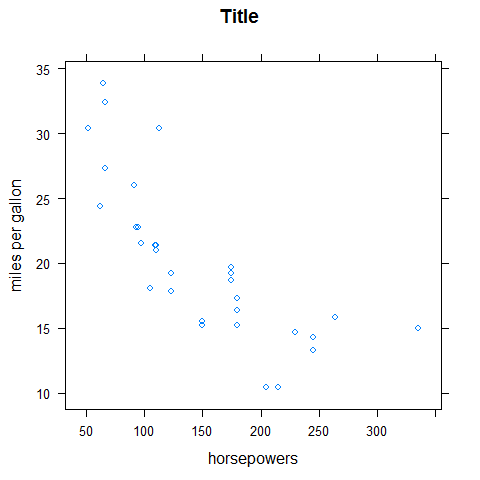
plot(hp, mpg, xlab = 'horsepower', ylab = 'miles per gallon')
A grid of plots.
par(mfrow = c(2, 1))

plot(mpg, hp, ylab = 'horsepower', xlab = 'miles per gallon')
boxplot(mpg ~ cyl, xlab = 'mile per gallon', ylab = 'number of cylinders', horizontal = TRUE)

par(mfrow = c(1, 2))

plot(mpg, hp, ylab = 'horsepower', xlab = 'miles per gallon')
boxplot(mpg ~ cyl, xlab = 'mile per gallon', ylab = 'number of cylinders', horizontal = TRUE)
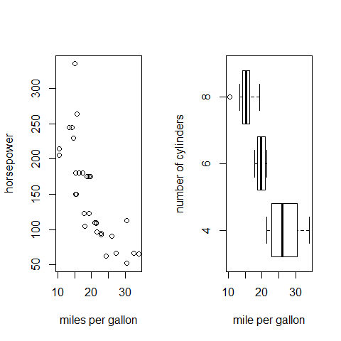
par(mfrow = c(1, 1))
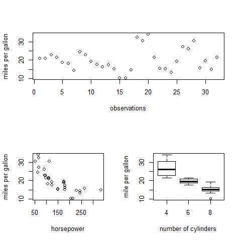
Other grids.
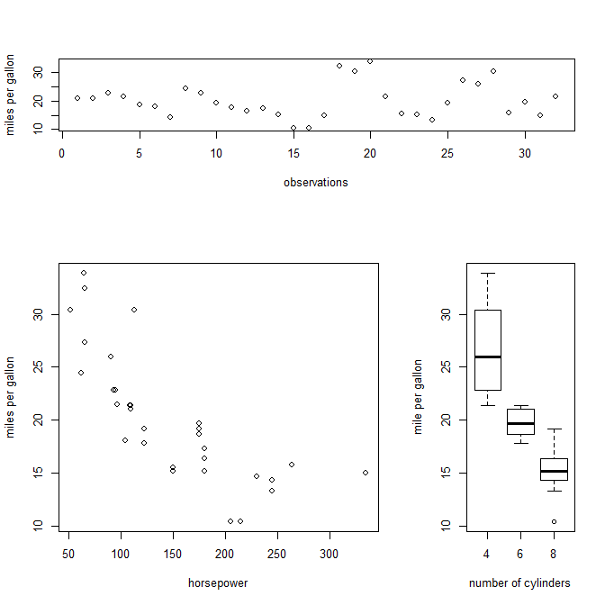
layout(matrix(c(1,1,2,3), 2, 2, byrow = TRUE))

plot(mpg, xlab = 'observations', ylab = 'miles per gallon')
plot(hp, mpg, xlab = 'horsepower', ylab = 'miles per gallon')
boxplot(mpg ~ cyl, ylab = 'mile per gallon', xlab = 'number of cylinders')
# view
matrix(c(1,2,1,3), 2, 2, byrow = TRUE)
1 2 3 | |
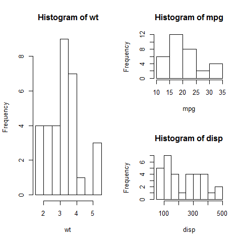
layout(matrix(c(1,2,1,3), 2, 2, byrow = TRUE))

hist(wt)
hist(mpg)
hist(disp)
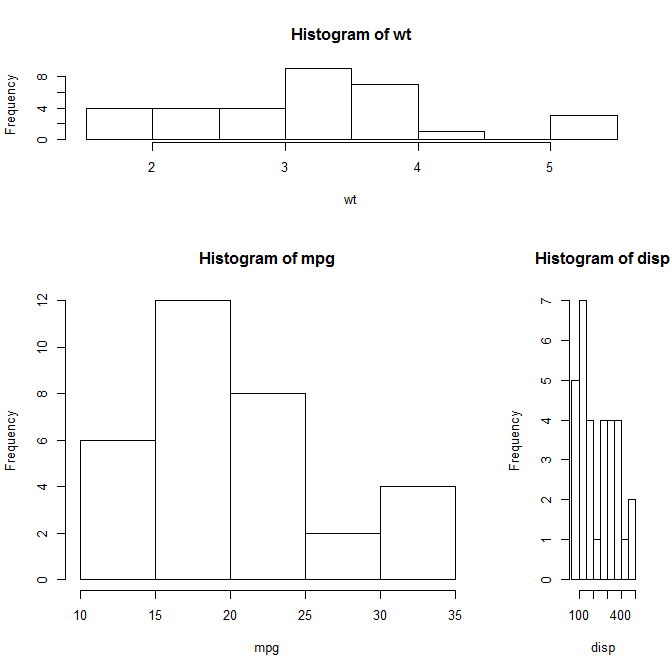
layout(matrix(c(1,1,2,3), 2, 2, byrow = TRUE),  widths = c(3,1), heights = c(1,2))

hist(wt)
hist(mpg)
hist(disp)
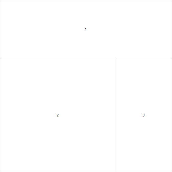
nf <- layout(matrix(c(1,1,2,3), 2, 2, byrow = TRUE), widths = lcm(12), heights = lcm(6))
layout.show(nf)
plot(mpg, xlab = 'observations', ylab = 'miles per gallon')
plot(hp, mpg, xlab = 'horsepower', ylab = 'miles per gallon')
boxplot(mpg ~ cyl, ylab = 'mile per gallon', xlab = 'number of cylinders')
Gridview with additional packages.
library(vcd)
mplot(A, B, C)
See the lattice and latticeExtra packages for built-in facet/gridview. ggplot2 as well.
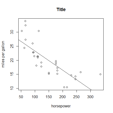
Plot and add ablines
plot(hp, mpg, xlab = 'horsepower', ylab = 'miles per gallon')

# abline(h = yvalues, v = xvalues)
abline(lm(mpg ~ hp))

# main = 'Title' or...
title('Title')
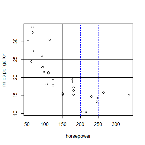
plot(hp, mpg, xlab = 'horsepower', ylab = 'miles per gallon')

abline(h = c(20, 25))
abline(v = c(50, 150))
abline(v = seq(200, 300, 50), lty = 2, col = 'blue')
Add a legend
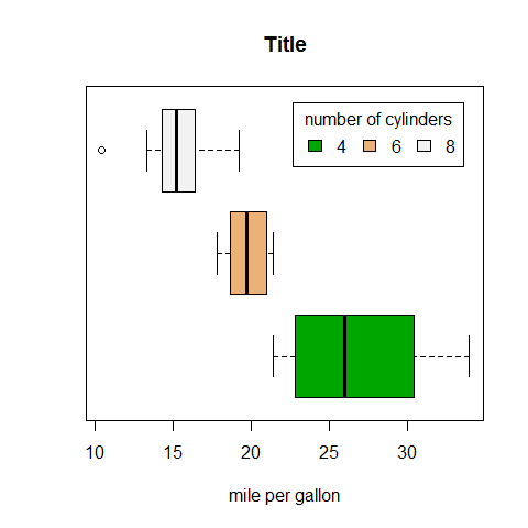
boxplot(mpg ~ cyl, main = 'Title',
   yaxt = 'n', xlab = 'mile per gallon', horizontal = TRUE, col = terrain.colors(3))

legend('topright', inset = 0.05, title = 'number of cylinders', c('4','6','8'), fill = terrain.colors(3), horiz = TRUE)
Save
mygraph <- plot(hp, mpg, main = 'Title', xlab = 'horsepower', ylab = 'miles per gallon')

pdf('mygraph.pdf')
png('mygraph.png')
jpeg('mygraph.jpg')
bmp('mygraph.bmp')
postscript('mygraph.ps')
View in a new window
Typing the function will open a new window to render the plot.
windows()for Windows.X11()for Linux.quartz()for OS X.
# open the new windows
windows()

plot(hp, mpg, main = 'Title', xlab = 'horsepower', ylab = 'miles per gallon')
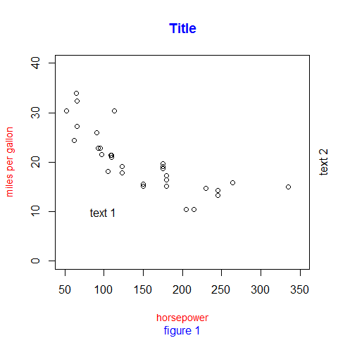
Enrich the plot, add text
plot(hp, mpg,
     main = 'Title', col.main = 'blue',
     sub = 'figure 1', col.sub = 'blue',
     xlab = 'horsepower',
     ylab = 'miles per gallon',
     col.lab = 'red', cex.lab = 0.9,
     xlim = c(50, 350),
     ylim = c(0, 40))

text(100, 10, 'text 1') # x and y coordinate
mtext('text 2', 4, line = 0.5) # pos = 1 (bottom), 2 (left), 3 (top), 4 (right); line (margin)
With locator(), use the mouse; with 1 for 1 click, 2 for… Find the coordinates to be entered in the code. For example (after two clicks):
> locator(2)
$x
[1] 212.5308 293.7854

$y
[1] 33.34040 31.87281
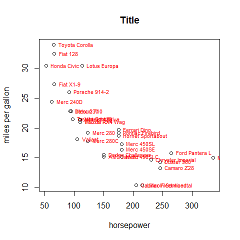
plot(hp, mpg,
     main = 'Title',
     xlab = 'horsepower',
     ylab = 'miles per gallon')

text(hp, mpg, row.names(mtcars), cex = 0.7, pos = 4, col = 'red')
Enrich the plot, add symbols
plot(hp, mpg,
     main = 'Title',
     xlab = 'horsepower',
     ylab = 'miles per gallon')

symbols(250, 20, squares = 1, add = TRUE, inches = 0.1, fg = 'red')
symbols(250, 25, circles = 1, add = TRUE, inches = 0.1, fg = 'red')
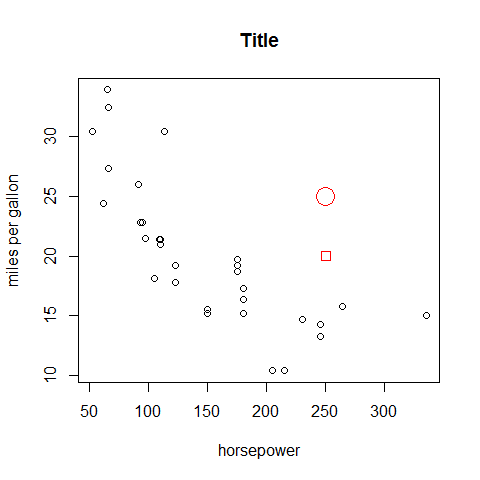
#rectangles
#stars
#thermometers
#boxplots
Combine plots; change pch = & col =
par(mfrow = c(2,2))

# 1
plot(hp, mpg,
     main = 'P1',
     xlab = 'horsepower',
     ylab = 'miles per gallon',
     pch = 1,
     col = 'black')

# 2
plot(hp, mpg,
     main = 'P2',
     xlab = 'horsepower',
     ylab = 'miles per gallon',
     pch = 3,
     col = 'blue',
     cex = 0.5)

# 3
plot(hp, mpg,
     main = 'P3',
     xlab = 'horsepower',
     ylab = 'miles per gallon',
     pch = 5,
     col = 'red',
     cex = 2)

# 4
plot(hp, mpg,
     main = 'P4',
     xlab = 'horsepower',
     ylab = 'miles per gallon',
     pch = 7,
     col = 'green')
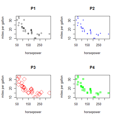
# reverse
par(mfrow = c(1,1))
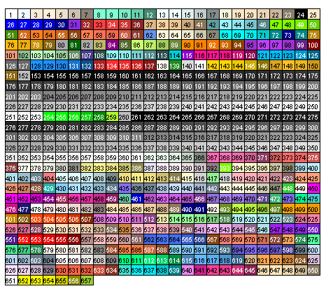
Change col =
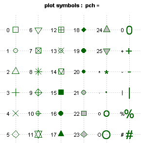
Change pch =
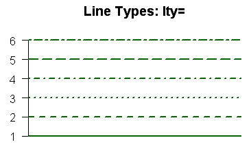
Change lty =
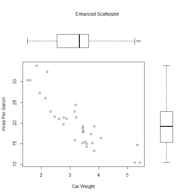
par(fig = c(0,0.8,0,0.8))

plot(mtcars$wt, mtcars$mpg, xlab = 'Car Weight',   ylab = 'miles Per Gallon')

par(fig = c(0,0.8,0.55,1), new = TRUE)

boxplot(mtcars$wt, horizontal = TRUE, axes = FALSE)

par(fig = c(0.65,1,0,0.8), new = TRUE)

boxplot(mtcars$mpg, axes = FALSE)

mtext('Enhanced Scatterplot', side = 3, outer = TRUE, line = -3)
# reverse
par(mfrow = c(1,1))
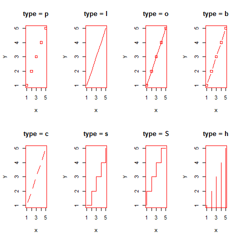
Change type =; without dots
x <- c(1:5); y <- x

par(pch = 22, col = 'red') # plotting symbol and color

par(mfrow = c(2,4)) # all plots on one page
opts = c('p','l','o','b','c','s','S','h')

for (i in 1:length(opts)) {
  heading = paste('type =',opts[i])
  plot(x, y, type = 'n', main = heading)
  lines(x, y, type = opts[i])
}
# reverse
par(mfrow = c(1,1), col = 'black')
Change type =; with dots
x <- c(1:5); y <- x

par(pch = 22, col = 'blue') # plotting symbol and color

par(mfrow = c(2,4)) # all plots on one page
opts = c('p','l','o','b','c','s','S','h')

for (i in 1:length(opts)) {
  heading = paste('type =',opts[i])
  plot(x, y, main = heading)
  lines(x, y, type = opts[i])
}
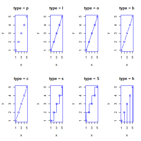
# reverse
par(mfrow = c(1,1), col = 'black')
Add or modify the axes
plot(hp, mpg,
     main = 'Title',
     xlab = 'horsepower',
     ylab = 'miles per gallon',
     xaxt = 'n',
     yaxt = 'n')

axis(1, at = c(100, 200, 300), labels = NULL, pos = 15, lty = 'dashed', col = 'green', las = 2, tck = -0.05)

axis(4, at = c(20, 30), labels = c('bt', 'up'), pos = 125, lty = 'dashed', col = 'blue', las = 2, tck = -0.05)
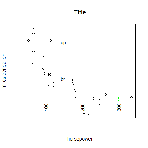
# reverse
par(las = 1)
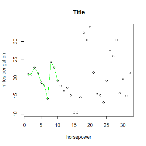
Add layers to the first plot
plot(mpg,
     main = 'Title',
     xlab = 'horsepower',
     ylab = 'miles per gallon')

# add lines
lines(mpg[1:10], type = 'l', col = 'green')
Univariate Plots
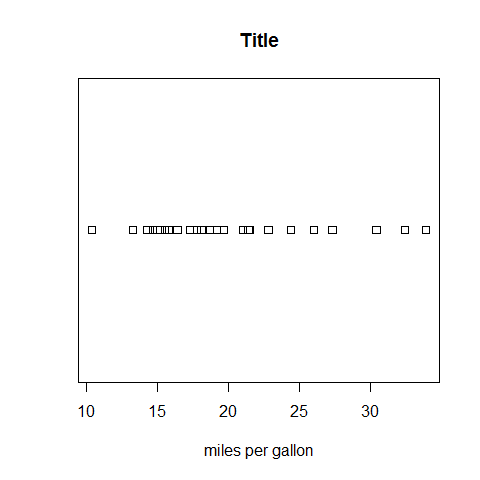
Plot; continuous
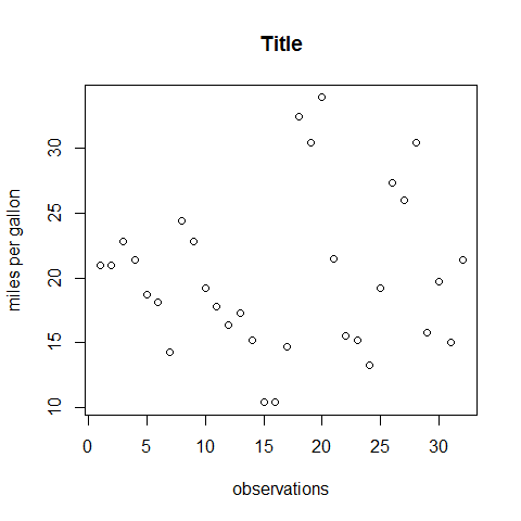
plot(mpg, main = 'Title', xlab = 'observations', ylab = 'miles per gallon')
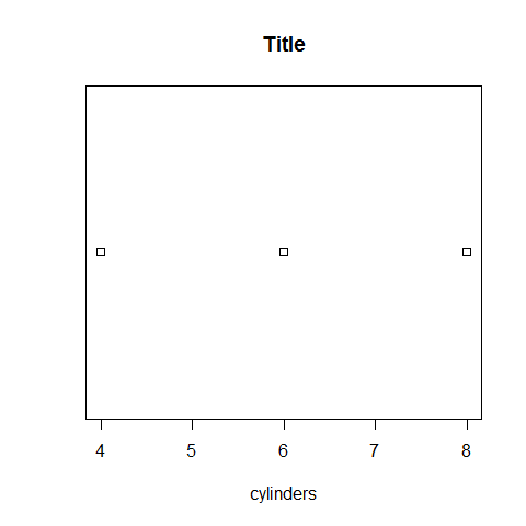
Plot; categorical
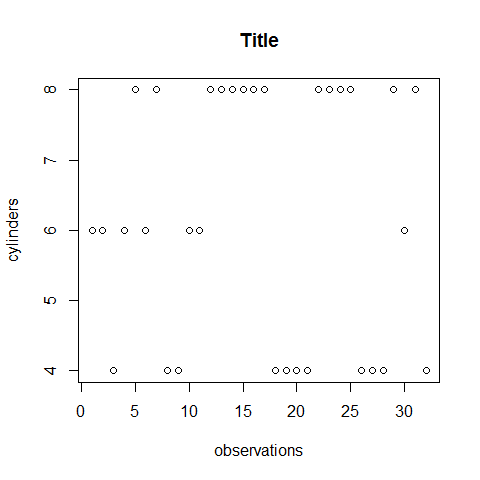
plot(cyl, main = 'Title', xlab = 'observations', ylab = 'cylinders')
QQnorm; continuous
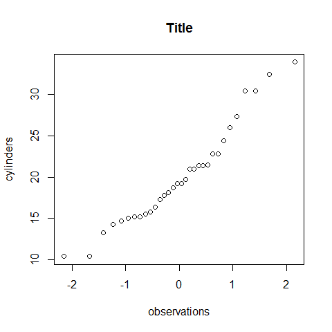
qqnorm(mpg, main = 'Title', xlab = 'observations', ylab = 'cylinders')
QQnorm; categorical
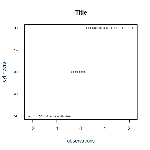
qqnorm(cyl, main = 'Title', xlab = 'observations', ylab = 'cylinders')
Stripchart; continuous
stripchart(mpg, main = 'Title', xlab = 'miles per gallon')
Stripchart; categorical
stripchart(cyl, main = 'Title', xlab = 'cylinders')
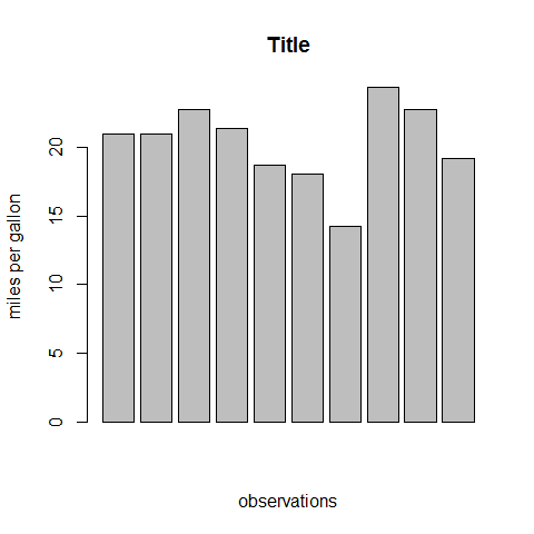
Barplot (vertical); continuous
barplot(mpg[1:10], main = 'Title', xlab = 'observations', ylab = 'miles per gallon')
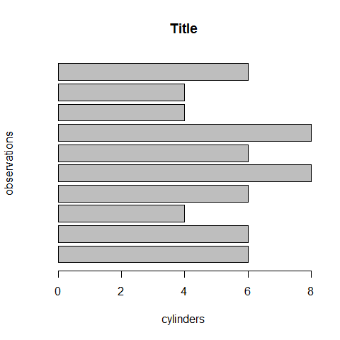
Barplot (horizontal); categorical
barplot(cyl[1:10], main = 'Title', horiz = TRUE, xlab = 'cylinders', ylab = 'observations')
Barplots options
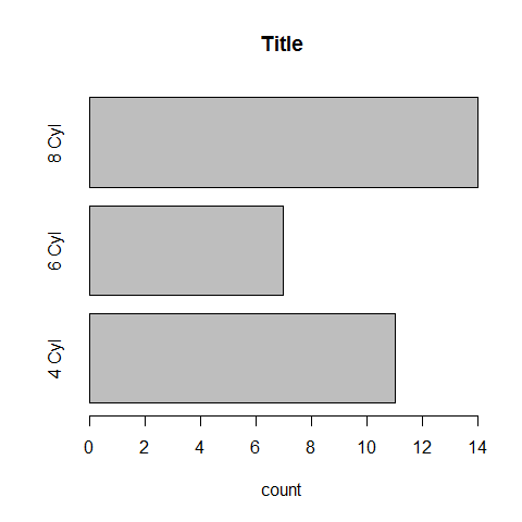
Group with table().
counts <- table(cyl)
counts
1 2 3 | |
barplot(counts, main = 'Title', horiz = TRUE, xlab = 'count', names.arg = c('4 Cyl', '6 Cyl', '8 Cyl'))
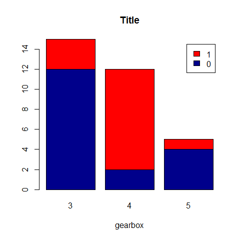
counts <- table(vs, gear)
counts
1 2 3 4 | |
barplot(counts, main = 'Title', xlab = 'gearbox', col = c('darkblue', 'red'), legend = rownames(counts))
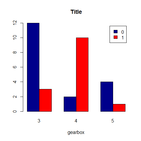
counts <- table(vs, gear)
counts
1 2 3 4 | |
barplot(counts, main = 'Title', xlab='gearbox', col = c('darkblue', 'red'), legend = rownames(counts), beside = TRUE)
Group with aggregate().
aggregate(mtcars, by = list(cyl, vs), FUN = mean, na.rm = TRUE)
1 2 3 4 5 6 7 8 9 10 11 12 | |
par(las = 2) # make label text perpendicular to axis

par(mar = c(5, 8, 4, 2)) # increase y-axis margin.

counts <- table(mtcars$gear)
barplot(counts, main = 'Car Distribution', horiz = TRUE, names.arg = c('3 Gears', '4 Gears', '5   Gears'), cex.names = 0.8)
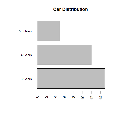
# reverse
par(las = 1)
Colors.
library(RColorBrewer)

par(mfrow = c(2, 1))

barplot(iris$Petal.Length)
barplot(table(iris$Species, iris$Sepal.Length), col = brewer.pal(3, 'Set1'))
par(mfrow = c(1, 1))
Pie Chart
Avoid!
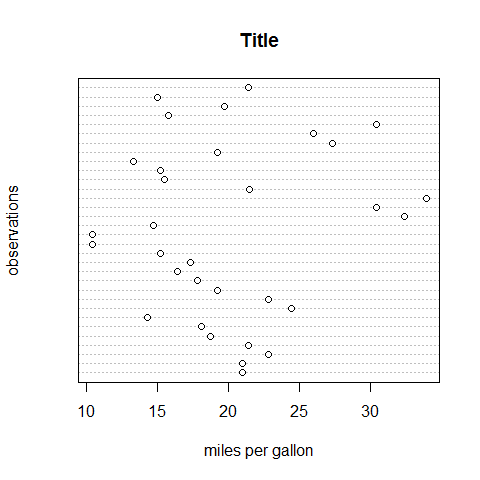
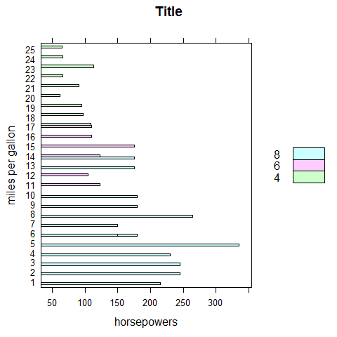
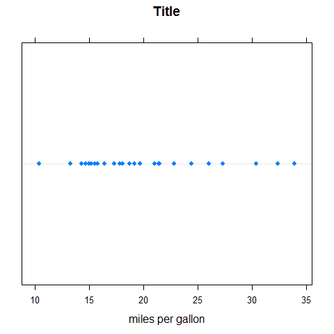
Dotchart; continuous
dotchart(mpg, main = 'Title', xlab = 'miles per gallon', ylab = 'observations')
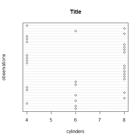
Dotchart; categorical
dotchart(cyl, main = 'Title', xlab = 'cylinders', ylab = 'observations')
Dotchart options
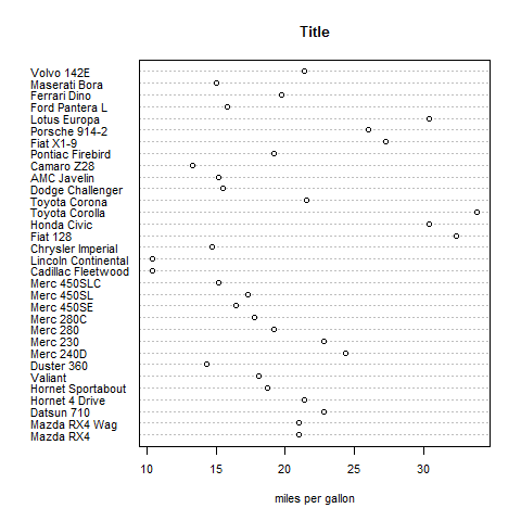
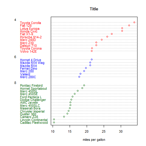
dotchart(mpg,labels = row.names(mtcars), cex = 0.7, main = 'Title', xlab = 'miles per gallon')
# sort by mpg
x <- mtcars[order(mpg),]

# must be factors
x$cyl <- factor(x$cyl)
x$color[x$cyl == 4] <- 'red'
x$color[x$cyl == 6] <- 'blue'
x$color[x$cyl == 8] <- 'darkgreen'

dotchart(x$mpg, labels = row.names(x), cex = 0.7, groups = x$cyl, main = 'Title',  xlab = 'miles per gallon', gcolor = 'black', color = x$color)
More with the hmisc package and panel.dotplot() and in the lattice
package section.
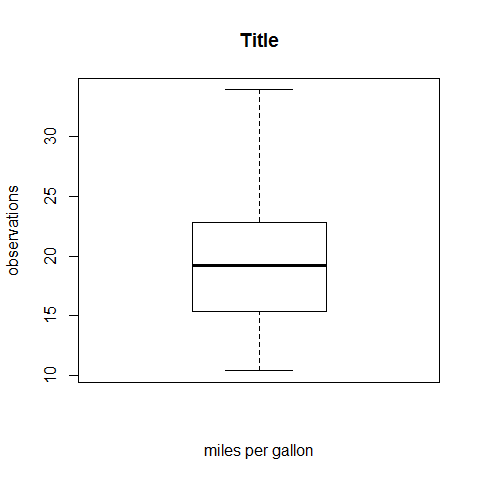
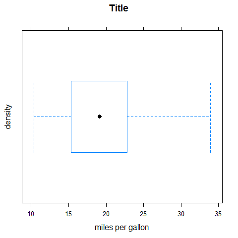
Boxplot; continuous
boxplot(mpg, main = 'Title', xlab = 'miles per gallon', ylab = 'observations')
Stem; continuous
stem(mpg)
1 2 3 4 5 6 7 8 9 10 11 12 13 14 15 | |
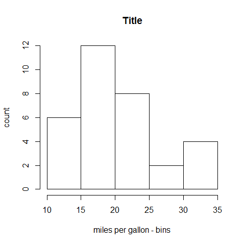
Histogram; continuous
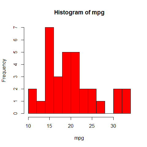
hist(mpg, main = 'Title', xlab = 'miles per gallon - bins', ylab = 'count')
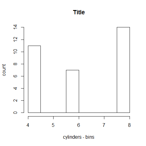
Histogram; categorical
hist(cyl, main = 'Title', xlab = 'cylinders - bins', ylab = 'count')
Histogram options
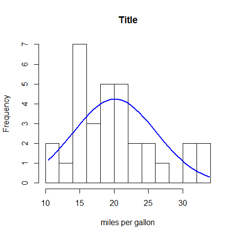
hist(mpg, breaks = 12, col = 'red')
x <- mpg

h <- hist(x, breaks = 10, main = 'Title', xlab = 'miles per gallon')

xfit <- seq(min(x), max(x),length = 40)
yfit <- dnorm(xfit, mean = mean(x), sd = sd(x))
yfit <- yfit*diff(h$mids[1:2])*length(x)

lines(xfit, yfit, col = 'blue', lwd = 2)
Colors.
library(RColorBrewer)

par(mfrow = c(2, 3))

hist(VADeaths, breaks = 10, col = brewer.pal(3, 'Set3'), main = '3, Set3')
hist(VADeaths, breaks = 4, col = brewer.pal(3, 'Set2'), main = '3, Set2')
hist(VADeaths, breaks = 8, col = brewer.pal(3, 'Set1'), main = '3, Set1')
hist(VADeaths, breaks = 2, col = brewer.pal(8, 'Set3'), main = '8, Set3')
hist(VADeaths, breaks = 10, col = brewer.pal(8, 'Greys'), main = '8, Greys')
hist(VADeaths, breaks = 10, col = brewer.pal(8, 'Greens'), main = '8, Greens')
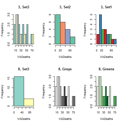
par(mfrow = c(1, 1))
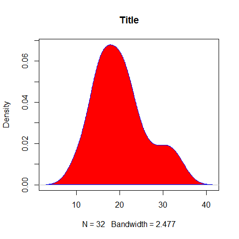
Density Plot; continuous
plot(density(mpg), main = 'Title')
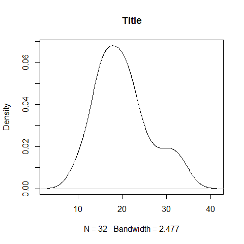
plot(density(mpg), main = 'Title')

polygon(density(mpg), col = 'red', border = 'blue')
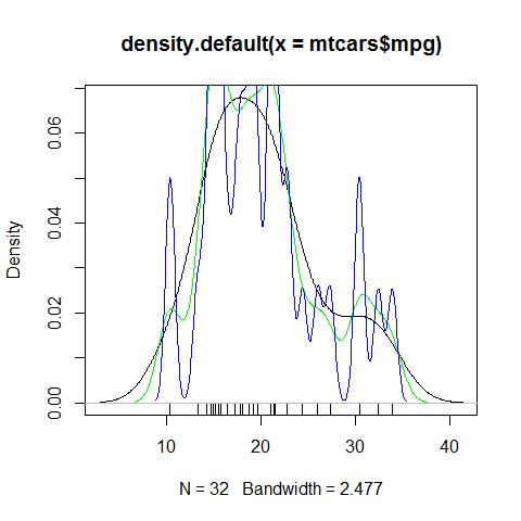
d1 <- density(mtcars$mpg)
plot(d1)
rug(mtcars$mpg)

lines(density(mtcars$mpg, d1$bw/2), col = 'green')
lines(density(mtcars$mpg, d1$bw/5), col = 'blue')
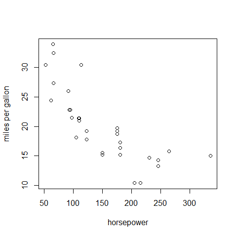
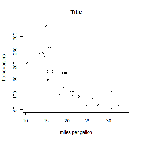
Bivariate (Multivariate) Plots
Plot, continuous/continuous
plot(mpg, hp, main = 'Title', xlab = 'miles per gallon', ylab = 'horsepowers')
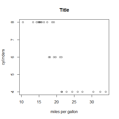
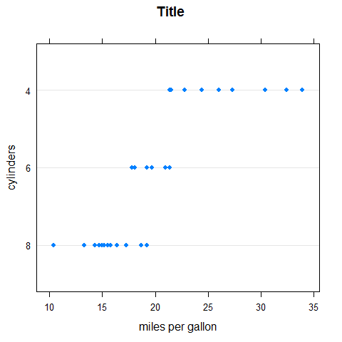
Plot, continuous/categorical
plot(mpg, cyl, main = 'Title', xlab = 'miles per gallon', ylab = 'cylinders')
Plot options
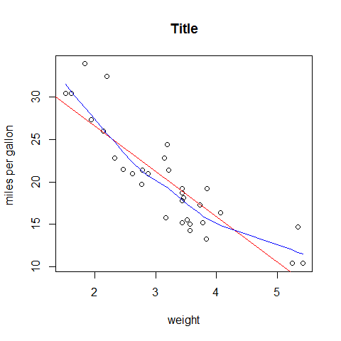
plot(wt, mpg, main = 'Title', xlab = 'weight', ylab = 'miles per gallon ')

abline(lm(mpg ~ wt), col = 'red') # regression
lines(lowess(wt, mpg), col = 'blue') # lowess line
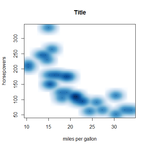
SmoothScatter; continuous/continuous
smoothScatter(mpg, hp, main = 'Title', xlab = 'miles per gallon', ylab = 'horsepowers')
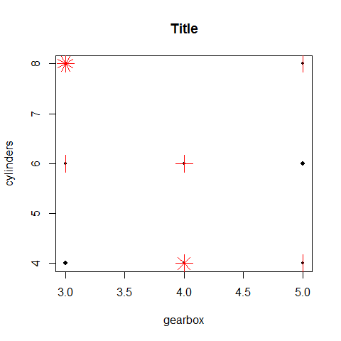
Sunflowerplot; categorical/categorical
Special symbols at each location: one observation = one dot; more observations = cross, star, etc.
sunflowerplot(gear, cyl, main = 'Title', xlab = 'gearbox', ylab = 'cylinders')
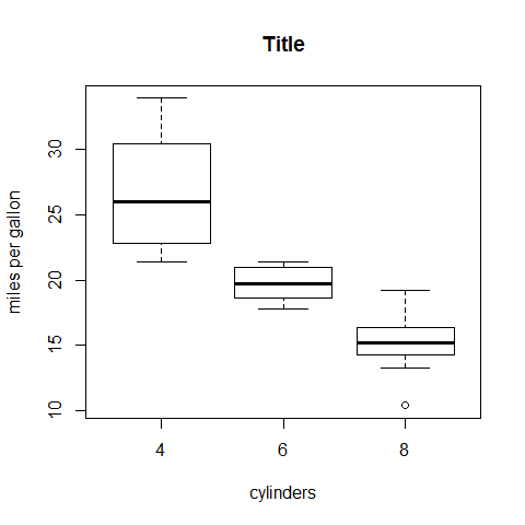
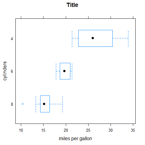
Boxplot
boxplot(mpg ~ cyl, main = 'Title', xlab = 'cylinders', ylab = 'miles per gallon')
Colors.
library(RColorBrewer)
par(mfrow = c(1, 2))
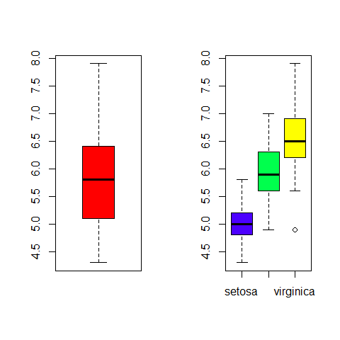
boxplot(iris$Sepal.Length, col = 'red')
boxplot(iris$Sepal.Length ~ iris$Species, col = topo.colors(3))
par(mfrow = c(1, 1))
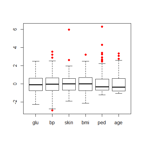
library(dplyr)

data(Pima.tr2, package = 'MASS')

PimaV <- select(Pima.tr2, glu:age)
boxplot(scale(PimaV), pch = 16, outcol = 'red')
Boxplot options
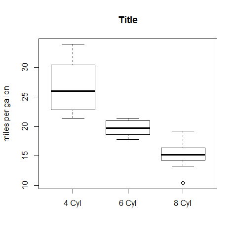
four <- subset(mpg, cyl == 4)
six <- subset(mpg, cyl == 6)
eight <- subset(mpg, cyl == 8)

boxplot(four, six, eight, main = 'Title', ylab = 'miles per gallon')

axis(1, at = c(1, 2, 3), labels = c('4 Cyl', '6 Cyl', '8 Cyl'))
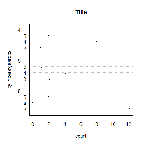
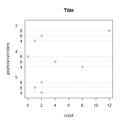
Dotchart
counts <- table(gear, cyl)
counts
1 2 3 4 5 | |
dotchart(counts, main = 'Title', xlab = 'count', ylab = 'cylinders/gearbox')
counts <- table(cyl, gear)
counts
1 2 3 4 5 | |
dotchart(counts, main = 'Title', xlab = 'count', ylab = 'gearbox/cylinders')
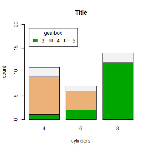
Barplot with its options
Vertical or horizontal. The legend as well can be horizontal or vertical.
counts <- table(gear, cyl)
counts
1 2 3 4 5 | |
barplot(counts, main = 'Title', xlab = 'cylinders', ylab = 'count', ylim = c(0, 20), col = terrain.colors(3))

legend('topleft', inset = .04, title = 'gearbox',
   c('3','4','5'), fill = terrain.colors(3), horiz = TRUE)
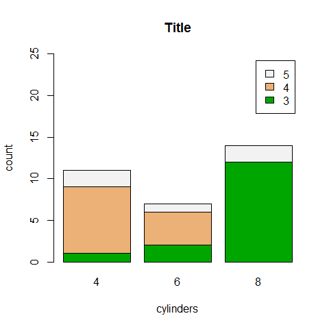
counts <- table(gear, cyl)
counts
1 2 3 4 5 | |
barplot(counts, main = 'Title', xlab = 'cylinders', ylab = 'count', ylim = c(0, 25), col = terrain.colors(3), legend = rownames(counts))
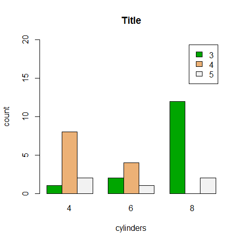
counts <- table(gear, cyl)
counts
1 2 3 4 5 | |
barplot(counts, main = 'Title', xlab = 'cylinders', ylab = 'count', ylim = c(0, 20), col = terrain.colors(3), legend = rownames(counts), beside = TRUE)
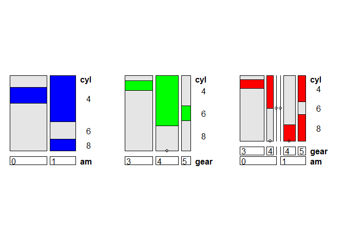
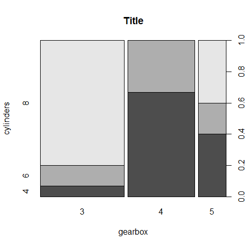
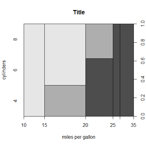
Spineplot
‘Count’ = blocks; categorical (with factors).
cyl2 <- as.factor(cyl) # mandatory for the y
gear2 <- as.factor(gear)

spineplot(gear2, cyl2, main = 'Title', xlab = 'gearbox', ylab = 'cylinders')
Count = blocks; continuous.
spineplot(mpg, cyl2, main = 'Title', xlab = 'miles per gallon', ylab = 'cylinders')
Mosaicplot
Count = blocks.
counts <- table(gear, cyl)
counts
1 2 3 4 5 | |
mosaicplot(counts, main = 'Title', xlab = 'gearbox', ylab = 'cylinders')

Multivariate Plots
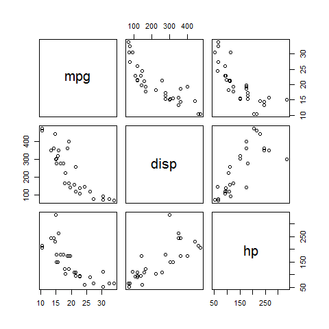
Pairs
pairs( ~mpg + disp + hp)
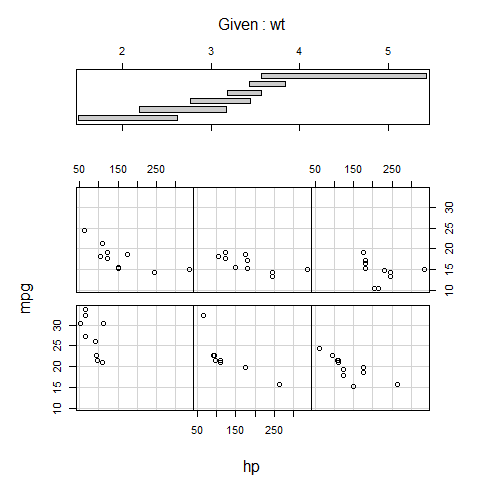
Coplot
coplot(mpg ~ hp | wt)
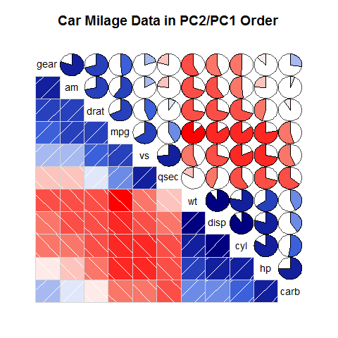
Correlograms
library(corrgram)

corrgram(mtcars, order = TRUE, lower.panel = panel.shade, upper.panel=panel.pie, text.panel = panel.txt, main = 'Car Milage Data in PC2/PC1 Order')
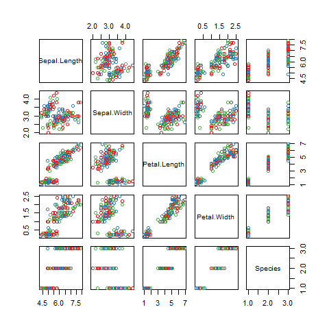
Plot a dataset with colors
library(RColorBrewer)

plot(iris, col = brewer.pal(3, 'Set1'))
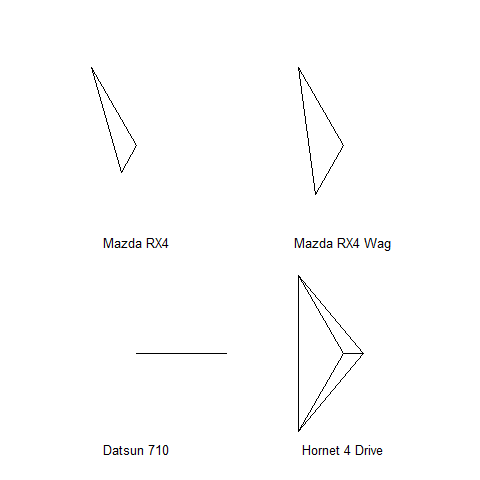
Stars
The star branches are explanatory; be careful with the interpretation! Well-advised for visual and pattern exploration.
mtcars[1:4, c(1, 4, 6)]
1 2 3 4 5 | |
stars(mtcars[1:4, c(1, 4, 6)])
Trivariate plots
image().contour().filled.contour().persp().symbols().
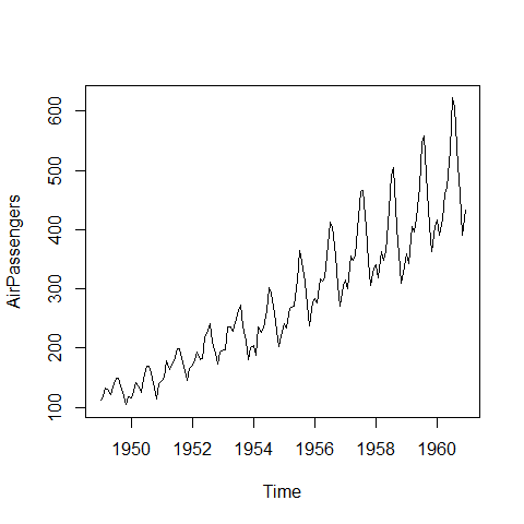
Times Series
Add packages: zoo and xts.
Basics
plot(AirPassengers, type = 'l')
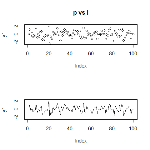
Change the type =
y1 <- rnorm(100)

par(mfrow = c(2, 1))

plot(y1, type = 'p', main = 'p vs l')
plot(y1, type = 'l')
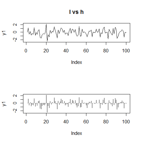
plot(y1, type = 'l', main = 'l vs h')
plot(y1, type = 'h')
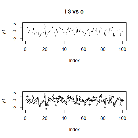
plot(y1, type = 'l', lty = 3, main = 'l 3 vs o')
plot(y1, type = 'o')
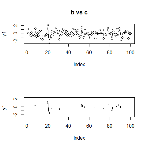
plot(y1, type = 'b', main = 'b vs c')
plot(y1, type = 'c')
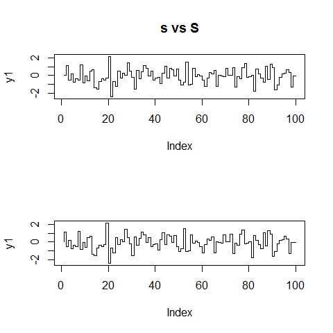
plot(y1, type = 's', main = 's vs S')
plot(y1, type = 'S')
# reverse
par(mfrow = c(1, 1))
Add a box
y1 <- rnorm(100)
y2 <- rnorm(100)

par(mfrow = (c(2, 1)))

plot(y1, type = 'l', axes = FALSE, xlab = '', ylab = '', main = '')

box(col = 'gray')

lines(x = c(20, 20, 40, 40), y = c(-7, max(y1), max(y1), -7), lwd = 3, col = 'gray')

plot(y2, type = 'l', axes = FALSE, xlab = '', ylab = '', main = '')

box(col = 'gray')

lines(x = c(20, 20, 40, 40), y = c(7, min(y2), min(y2), 7), lwd = 3, col = 'gray')
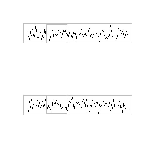
# reverse
par(mfrow = c(1,1))
Add lines and text within the plot
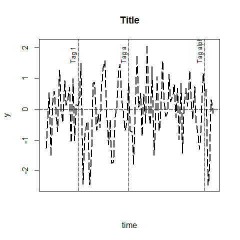
y1 <- rnorm(100)

# x goes from 0 to 100
# xaxt = 'n' remove the x ticks
plot(y1, type = 'l', lwd = 2, lty = 'longdash', main = 'Title', ylab = 'y', xlab = 'time', xaxt = 'n')

abline(h = 0, lty = 'longdash')

abline(v = 20, lty = 'longdash')
abline(v = 50, lty = 'longdash')
abline(v = 95, lty = 'longdash')

text(17, 1.5, srt = 90, adj = 0, labels = 'Tag 1', cex = 0.8)
text(47, 1.5, srt = 90, adj = 0, labels = 'Tag a', cex = 0.8)
text(92, 1.5, srt = 90, adj = 0, labels = 'Tag alpha', cex = 0.8)
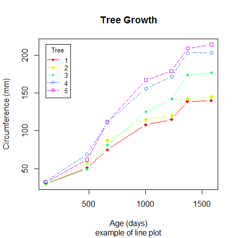
A comprehensive example
# new data
head(Orange)
1 2 3 4 5 6 7 | |
# convert factor to numeric for convenience
Orange$Tree <- as.numeric(Orange$Tree)
ntrees <- max(Orange$Tree)

# get the range for the x and y axis
xrange <- range(Orange$age)
yrange <- range(Orange$circumference)

# set up the plot
plot(xrange, yrange, type = 'n', xlab = 'Age (days)',
   ylab = 'Circumference (mm)' )
colors <- rainbow(ntrees)
linetype <- c(1:ntrees)
plotchar <- seq(18, 18 + ntrees, 1)

# add lines
for (i in 1:ntrees) {
  tree <- subset(Orange, Tree == i)
  lines(tree$age, tree$circumference, type = 'b', lwd = 1.5,
    lty = linetype[i], col = colors[i], pch = plotchar[i])
}

# add a title and subtitle
title('Tree Growth', 'example of line plot')

# add a legend
legend(xrange[1], yrange[2], 1:ntrees, cex = 0.8, col = colors,
   pch = plotchar, lty = linetype, title = 'Tree')
Regressions and Residual Plots
# first
regr <- lm(mpg ~ hp)

summary(regr)
1 2 3 4 5 6 7 8 9 10 11 12 13 14 15 16 17 18 | |
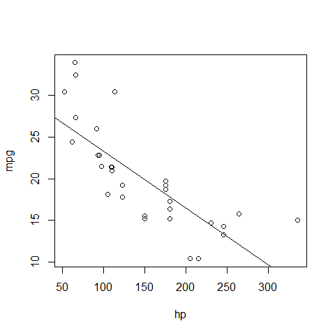
plot(mpg ~ hp)
abline(regr)
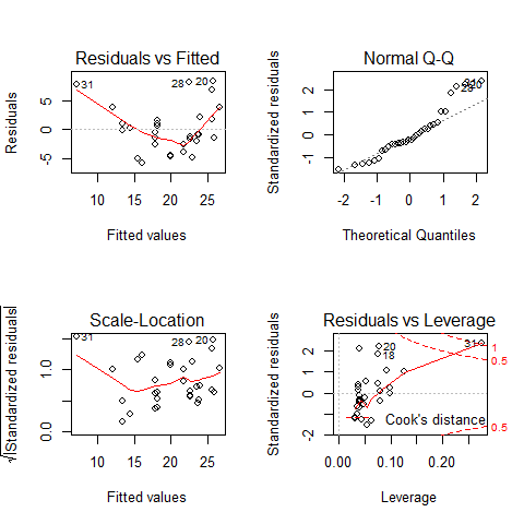
par(mfrow = c(2, 2))

# then
plot(regr)
# reverse
par(mfrow = c(1, 1))
The lattice and latticeExtra Packages
library(lattice)
Coloring
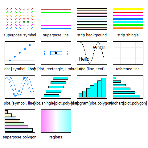
# Show the default settings
show.settings()
# Save the default theme
mytheme <- trellis.par.get()
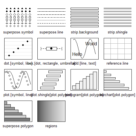
# Turn the B&W
trellis.par.set(canonical.theme(color = FALSE))
show.settings()
Documentation
A note on reordering the levels (factors)
# start
cyl <- mtcars$cyl
cyl <- as.factor(cyl)
cyl
1 2 | |
levels(cyl)
1 | |
# option 1
cyl <- factor(cyl, levels = c('8', '6', '4'))
# or levels = 3:1
# or levels = letters[3:1]
levels(cyl)
1 | |
cyl <- mtcars$cyl
cyl <- as.factor(cyl)
# option 2
cyl <- reorder(cyl, new.order = 3:1)
levels(cyl)
1 | |
library(lattice)
# normalized x-axis for comparison
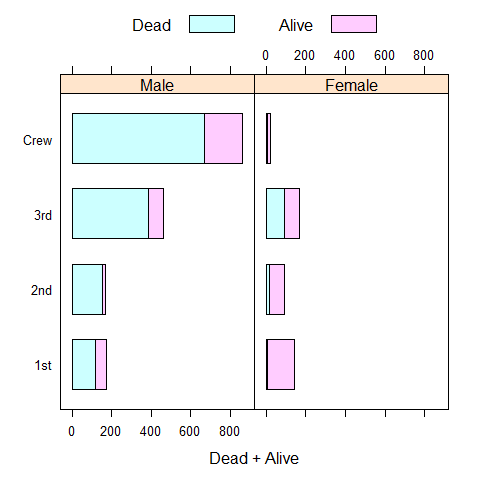
barchart(Class ~ Freq | Sex + Age, data = as.data.frame(Titanic), groups = Survived, stack = TRUE, layout = c(4, 1), auto.key = list(title = 'Survived', columns = 2))
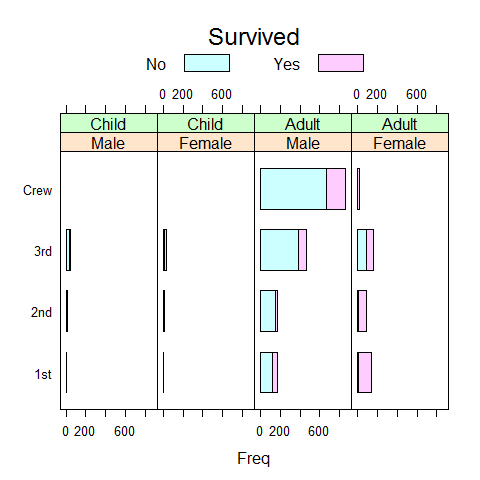
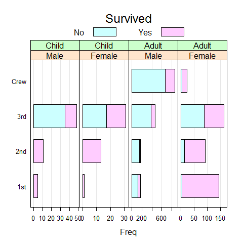
# free x-axis
barchart(Class ~ Freq | Sex + Age, data = as.data.frame(Titanic), groups = Survived, stack = TRUE, layout = c(4, 1), auto.key = list(title = 'Survived', columns = 2), scales = list(x = 'free'))

# or
bc.titanic <- barchart(Class ~ Freq | Sex + Age, data = as.data.frame(Titanic), groups = Survived, stack = TRUE, layout = c(4, 1), auto.key = list(title = 'Survived', columns = 2), scales = list(x = 'free'))

bc.titanic

# add bg grid
update(bc.titanic, panel = function(...) {
  panel.grid(h = 0, v = -1)
  panel.barchart(...)
})
# remove lines
update(bc.titanic, panel = function(...) {
  panel.barchart(..., border = 'transparent')
})
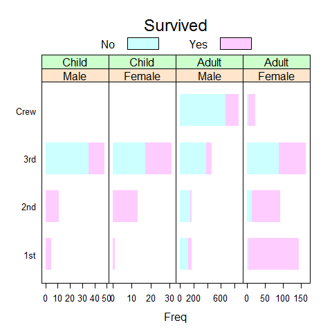
# or
update(bc.titanic, border = 'transparent')

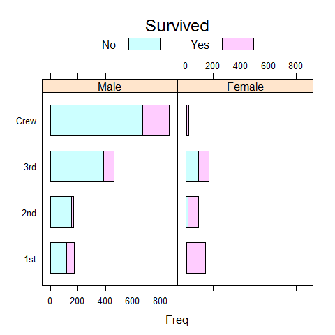
Titanic1 <- as.data.frame(as.table(Titanic[, , 'Adult' ,]))
Titanic1
1 2 3 4 5 6 7 8 9 10 11 12 13 14 15 16 17 | |
barchart(Class ~ Freq | Sex, Titanic1, groups = Survived, stack = TRUE, auto.key = list(title = 'Survived', columns = 2))
Titanic2 <- reshape(Titanic1, direction = 'wide', v.names = 'Freq', idvar = c('Class', 'Sex'), timevar = 'Survived')

names(Titanic2) <- c('Class', 'Sex', 'Dead', 'Alive')

barchart(Class ~ Dead + Alive | Sex, Titanic2, stack = TRUE, auto.key = list(columns = 2))
Uni-, Bi-, Multivariate Plots
Barchart
Like barplot().
# y ~ x
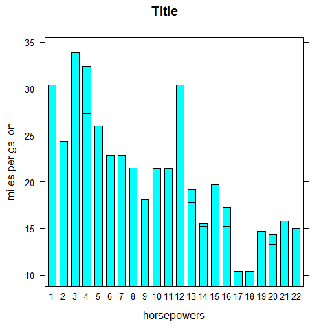
barchart(mpg ~ hp, main = 'Title', xlab = 'horsepowers', ylab = 'miles per gallon')
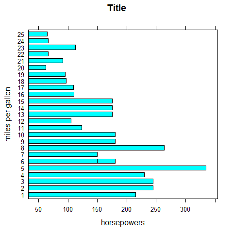
# y ~ x
barchart(mpg ~ hp, main = 'Title', xlab = 'horsepowers', ylab = 'miles per gallon', horizontal = FALSE)
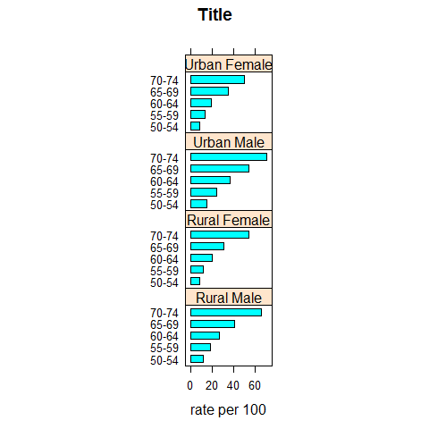
barchart(VADeaths, groups = FALSE, layout = c(1, 4), aspect = 0.7, reference =FALSE, main = 'Title', xlab = 'rate per 100')
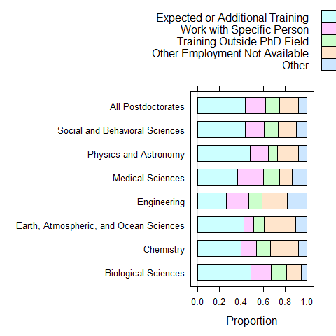
data(postdoc, package = 'latticeExtra')

barchart(prop.table(postdoc, margin = 1), xlab = 'Proportion', auto.key = list(adj = 1))
Change layout = c(x, y, page)
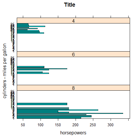
barchart(mpg ~ hp | factor(cyl), main = 'Title', xlab = 'horsepowers', ylab = 'cylinders - miles per gallon', layout = c(1,3))
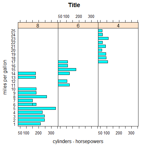
barchart(mpg ~ hp | factor(cyl), main = 'Title', xlab = 'cylinders - horsepowers', ylab = 'miles per gallon', layout = c(3,1))
Change aspect = 1
1 for square.
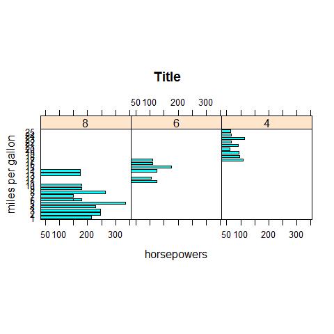
barchart(mpg ~ hp | factor(cyl), main = 'Title', xlab = 'horsepowers', ylab = 'miles per gallon', layout = c(3,1), aspect = 1)
Colors
barchart(mpg ~ hp, group = cyl, auto.key = list(space = 'right'), main = 'Title', xlab = 'horsepowers', ylab = 'miles per gallon')
shingle(); control the ranges.equal.count(); grid.
Dotplot
Like dotchart().
dotplot(mpg, main = 'Title', xlab = 'miles per gallon')
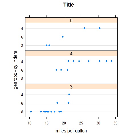
dotplot(factor(cyl) ~ mpg, main = 'Title', xlab = 'miles per gallon', ylab = 'cylinders')
dotplot(factor(cyl) ~ mpg | factor(gear), main = 'Title', xlab = 'gearbox - miles per gallon', ylab = 'cylinders', layout = c(3,1))
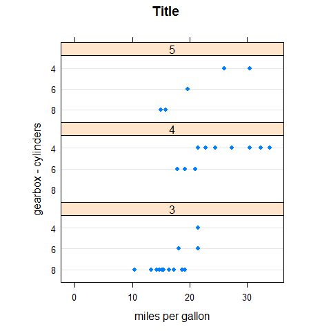
dotplot(factor(cyl) ~ mpg | factor(gear), main = 'Title', xlab = 'miles per gallon', ylab = 'gearbox - cylinders', layout = c(1,3), aspect = 0.3)
dotplot(factor(cyl) ~ mpg | factor(gear), main = 'Title', xlab = 'miles per gallon', ylab = 'gearbox - cylinders', layout = c(1,3), aspect = 0.3, origin = 0)
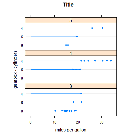
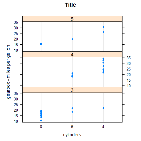
dotplot(factor(cyl) ~ mpg | factor(gear), main = 'Title', xlab = 'miles per gallon', ylab = 'gearbox - cylinders', layout = c(1,3), aspect = 0.3, origin = 0, type = c('p', 'h'))
Set auto.key.
# maybe we'll want this later
old.pars <- trellis.par.get()

#trellis.par.set(superpose.symbol = list(pch = c(1,3), col = 12:14))

trellis.par.set(superpose.symbol = list(pch = c(1,3), col = 1))

# Optionally put things back how they were
#trellis.par.set(old.pars)
Use auto.key.
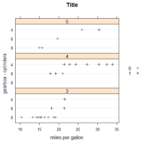
dotplot(factor(cyl) ~ mpg | factor(gear), main = 'Title', xlab = 'miles per gallon', ylab = 'gearbox - cylinders', layout = c(1,3), groups = vs, auto.key = list(space = 'right'))
trellis.par.set(old.pars)
trellis.par.set(superpose.symbol = list(pch = c(1,3), col = 1))
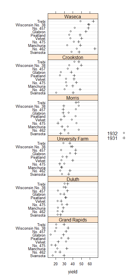
dotplot(variety ~ yield | site, barley, layout = c(1, 6), aspect = c(0.7), groups = year, auto.key = list(space = 'right'))
trellis.par.set(old.pars)
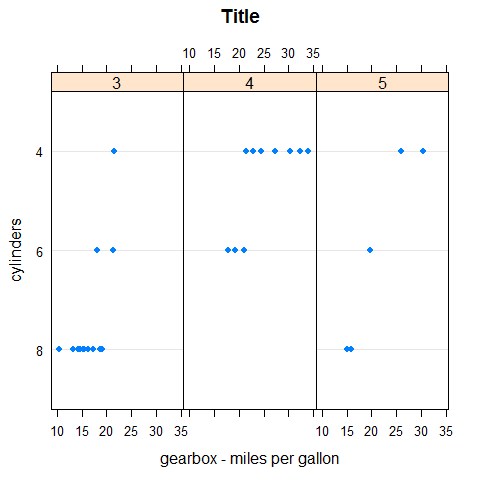
Vertical.
dotplot(mpg ~ factor(cyl) | factor(gear), main = 'Title', xlab = 'cylinders', ylab = 'gearbox - miles per gallon', layout = c(1,3), aspect = 0.3)
library(readr)
density <- read_csv('density.csv')
density$Density <- as.numeric(density$Density)
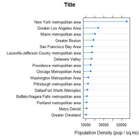
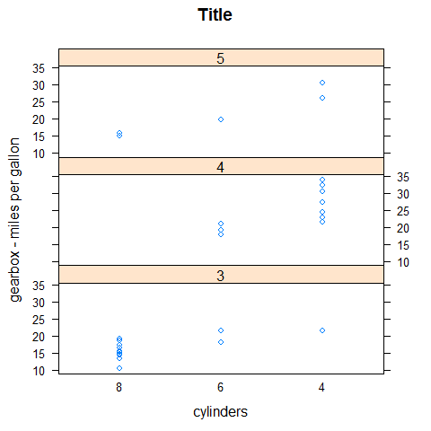
dotplot(reorder(MetropolitanArea, Density) ~ Density, density, type = c('p', 'h'), main = 'Title', xlab = 'Population Density (pop / sq.mi)')
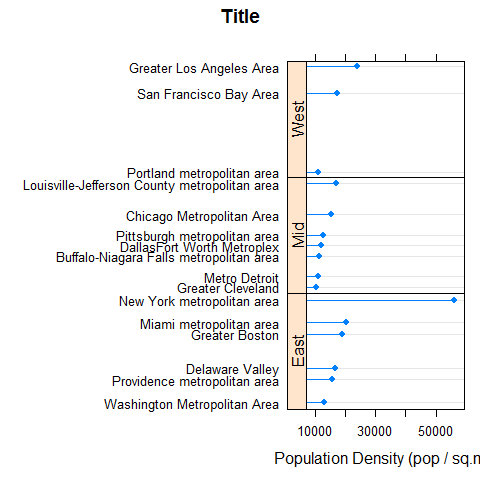
dotplot(reorder(MetropolitanArea, Density) ~ Density | Region, density, type = c('p', 'h'), strip = FALSE, strip.left = TRUE, layout = c(1, 3), scales = list(y = list(relation = 'free')), main = 'Title', xlab = 'Population Density (pop / sq.mi)')
Stripplot
Like stripchart().
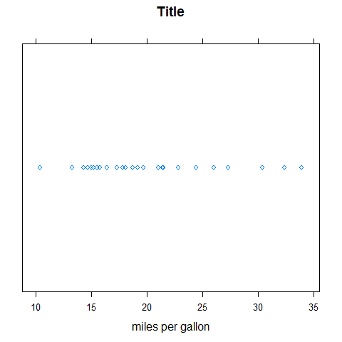
stripplot(mpg, main = 'Title', xlab = 'miles per gallon')
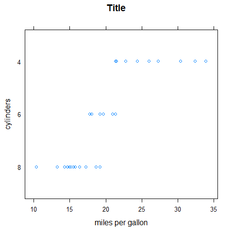
stripplot(factor(cyl) ~ mpg, main = 'Title', xlab = 'miles per gallon', ylab = 'cylinders')
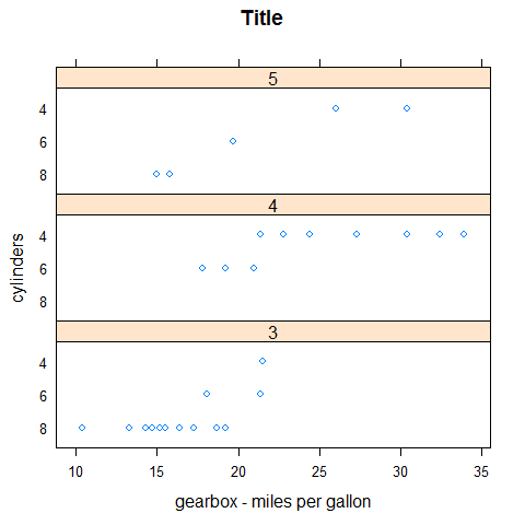
stripplot(factor(cyl) ~ mpg | factor(gear), main = 'Title', xlab = 'gearbox - miles per gallon', ylab = 'cylinders', layout = c(1,3))
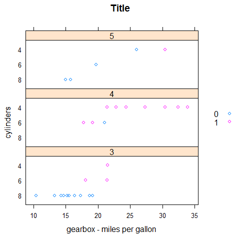
stripplot(factor(cyl) ~ mpg | factor(gear), main = 'Title', xlab = 'gearbox - miles per gallon', ylab = 'cylinders', layout = c(1,3), groups = vs, auto.key = list(space = 'right'))
stripplot(mpg ~ factor(cyl) | factor(gear), main = 'Title', xlab = 'cylinders', ylab = 'gearbox - miles per gallon', layout = c(1,3))
Histogram
Like hist().
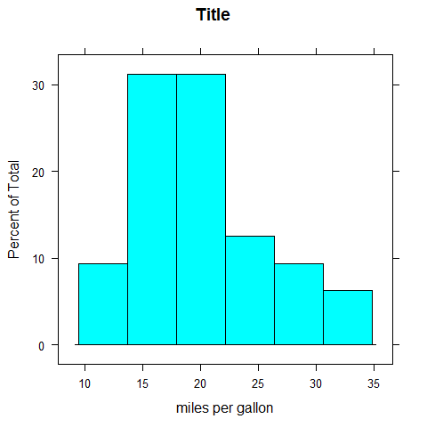
histogram(mpg, main = 'Title', xlab = 'miles per gallon')
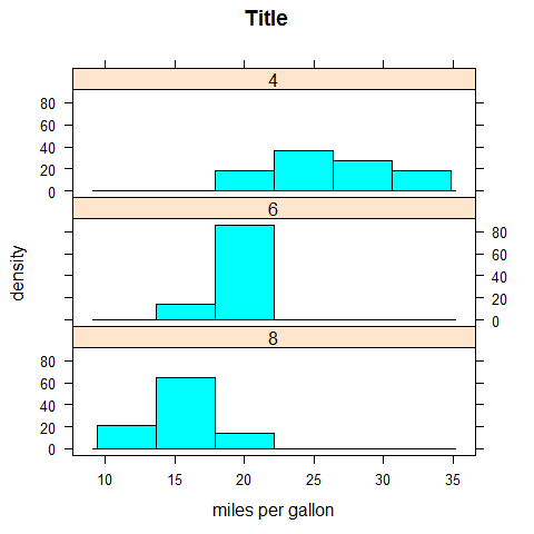
histogram(~mpg | factor(cyl), layout = c(1, 3), main = 'Title', xlab = 'miles per gallon', ylab = 'density')
Densityplot
Like plot.density().
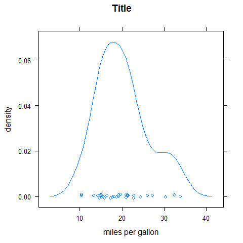
densityplot(mpg, main = 'Title', xlab = 'miles per gallon', ylab = 'density')
densityplot(~mpg | factor(cyl), layout = c(1, 3), main = 'Title', xlab = 'miles per gallon', ylab = 'density')
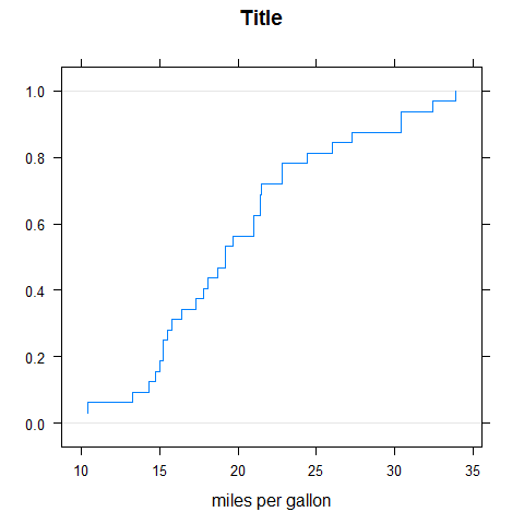
ECDFplot
library(latticeExtra)

ecdfplot(mpg, main = 'Title', xlab = 'miles per gallon', ylab = '')
BWplot
Like boxplot.
bwplot(mpg, main = 'Title', xlab = 'miles per gallon', ylab = 'density')
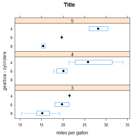
bwplot(factor(cyl) ~ mpg, main = 'Title', xlab = 'miles per gallon', ylab = 'cylinders')
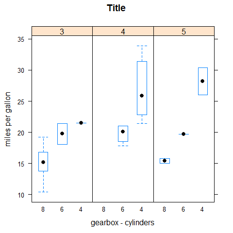
bwplot(factor(cyl) ~ mpg | factor(gear), main = 'Title', xlab = 'miles per gallon', ylab = 'gearbox - cylinders', layout = c(1,3))
bwplot(mpg ~ factor(cyl) | factor(gear), main = 'Title', xlab = 'gearbox - cylinders', ylab = 'miles per gallon', layout = c(3,1))
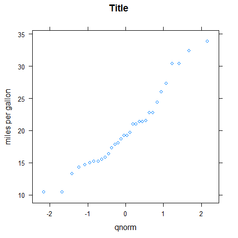
QQmath
Like qqnorm().
qqmath(mpg, main = 'Title', ylab = 'miles per gallon')
XYplot
Like plot().
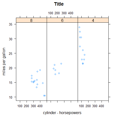
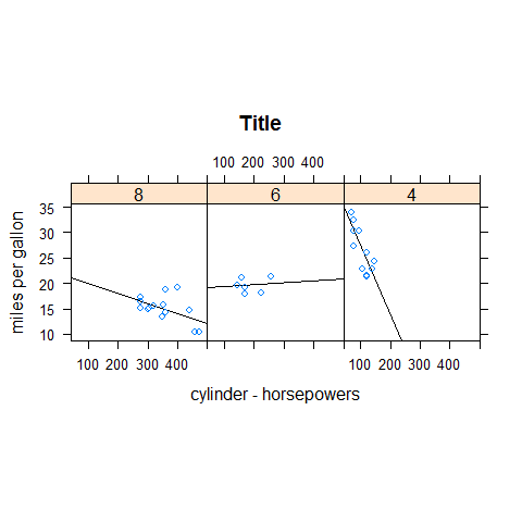
xyplot(mpg ~ disp | factor(cyl), main = 'Title', xlab = 'horsepower', ylab = 'cylinders - miles per gallon', layout = c(1,3))
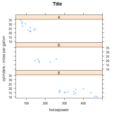
xyplot(mpg ~ disp | factor(cyl), main = 'Title', xlab = 'cylinder - horsepowers', ylab = 'miles per gallon', layout = c(3,1))
XYplot options
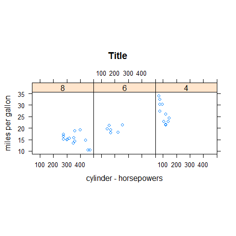
xyplot(mpg ~ disp | factor(cyl), main = 'Title', xlab = 'cylinder - horsepowers', ylab = 'miles per gallon', layout = c(3,1), aspect = 1)
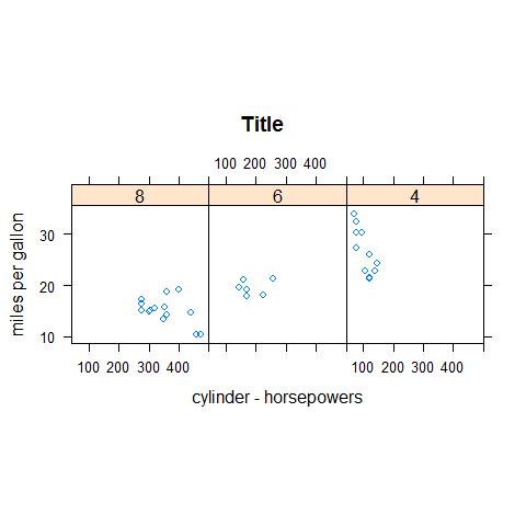
xyplot(mpg ~ disp | factor(cyl), main = 'Title', xlab = 'cylinder - horsepowers', ylab = 'miles per gallon', layout = c(3,1), aspect = 1, scales = list(y = list(at = seq(10, 30, 10))))
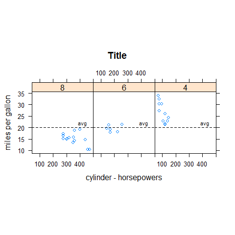
meanmpg <- mean(mpg)

xyplot(mpg ~ disp | factor(cyl), main = 'Title', xlab = 'cylinder - horsepowers', ylab = 'miles per gallon', layout = c(3,1), aspect = 1, panel = function(...) {
  panel.xyplot(...)
  panel.abline(h = meanmpg, lty = 'dashed')
  panel.text(450, meanmpg + 1, 'avg', adj = c(1,  0), cex = 0.7)
})
xyplot(mpg ~ disp | factor(cyl), main = 'Title', xlab = 'cylinder - horsepowers', ylab = 'miles per gallon', layout = c(3,1), aspect = 1, panel = function(x, y, ...) {
    panel.lmline(x, y)
    panel.xyplot(x, y, ...)
})
panel.points().panel.lines().panel.segments().panel.arrows().panel.rect().panel.polygon().panel.text().panel.abline().panel.lmline().panel.xyplot().panel.curve().panel.rug().panel.grid().panel.bwplot().panel.histogram().panel.loess().panel.violin().panel.smoothScatter().- …
par.settings.- …
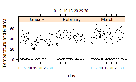
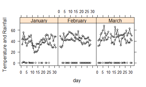
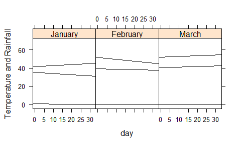
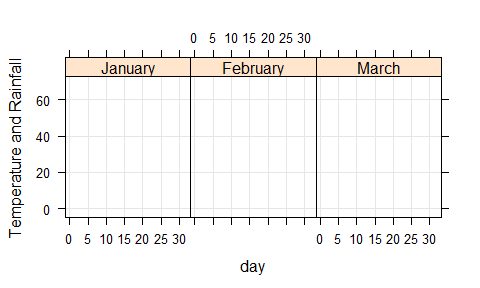
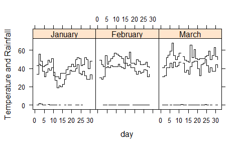
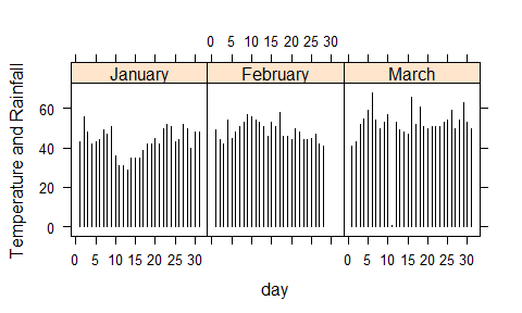
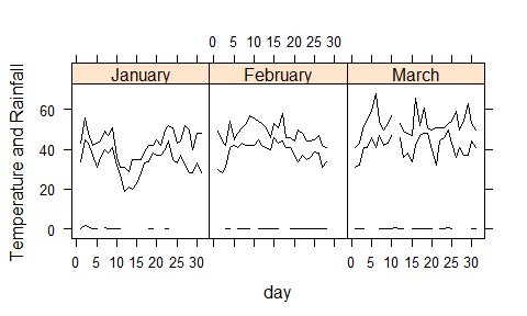
library(lattice)
data(SeatacWeather, package = 'latticeExtra')
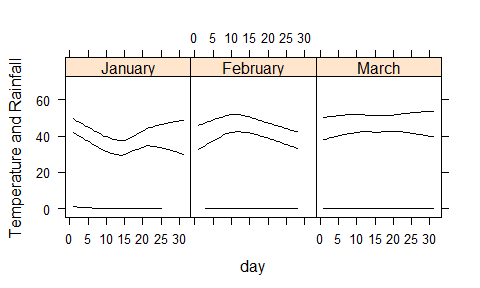
xyplot(min.temp + max.temp + precip ~ day | month, ylab = 'Temperature and Rainfall', data = SeatacWeather, layout = c(3,1), type = 'l', lty = 1, col = 'black')

xyplot(min.temp + max.temp + precip ~ day | month, ylab = 'Temperature and Rainfall', data = SeatacWeather, layout = c(3,1), type = 'p', lty = 1, col = 'black')
xyplot(min.temp + max.temp + precip ~ day | month, ylab = 'Temperature and Rainfall', data = SeatacWeather, layout = c(3,1), type = 'l', lty = 1, col = 'black')

xyplot(min.temp + max.temp + precip ~ day | month, ylab = 'Temperature and Rainfall', data = SeatacWeather, layout = c(3,1), type = 'o', lty = 1, col = 'black')
xyplot(min.temp + max.temp + precip ~ day | month, ylab = 'Temperature and Rainfall', data = SeatacWeather, layout = c(3,1), type = 'r', lty = 1, col = 'black')
xyplot(min.temp + max.temp + precip ~ day | month, ylab = 'Temperature and Rainfall', data = SeatacWeather, layout = c(3,1), type = 'g', lty = 1, col = 'black')
xyplot(min.temp + max.temp + precip ~ day | month, ylab = 'Temperature and Rainfall', data = SeatacWeather, layout = c(3,1), type = 's', lty = 1, col = 'black')
xyplot(min.temp + max.temp + precip ~ day | month, ylab = 'Temperature and Rainfall', data = SeatacWeather, layout = c(3,1), type = 'S', lty = 1, col = 'black')

xyplot(min.temp + max.temp + precip ~ day | month, ylab = 'Temperature and Rainfall', data = SeatacWeather, layout = c(3,1), type = 'h', lty = 1, col = 'black')
xyplot(min.temp + max.temp + precip ~ day | month, ylab = 'Temperature and Rainfall', data = SeatacWeather, layout = c(3,1), type = 'a', lty = 1, col = 'black')
xyplot(min.temp + max.temp + precip ~ day | month, ylab = 'Temperature and Rainfall', data = SeatacWeather, layout = c(3,1), type = 'smooth', lty = 1, col = 'black')
xyplot(mpg ~ hp, main = 'Title', xlab = 'horsepowers', ylab = 'miles per gallon')
xyplot(mpg ~ hp, main = 'Title', xlab = 'horsepowers', ylab = 'miles per gallon', type = 'o')
xyplot(mpg ~ hp, main = 'Title', xlab = 'horsepowers', ylab = 'miles per gallon', type = 'o', pch = 16, lty = 'dashed')
xyplot(mpg ~ hp, main = 'Title', xlab = 'horsepowers', ylab = 'miles per gallon')

data(USAge.df, package = 'latticeExtra')
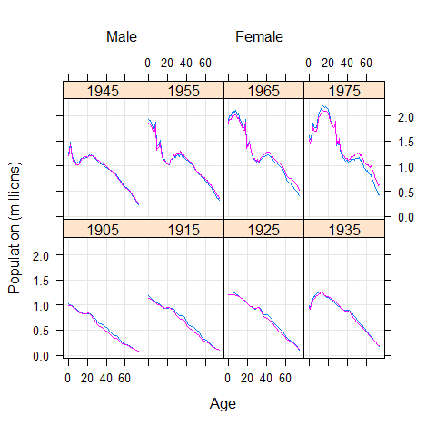
xyplot(Population ~ Age | factor(Year), USAge.df, groups = Sex, type = c('l', 'g'), auto.key = list(points = FALSE, lines = TRUE, columns = 2), aspect = 'xy', ylab = 'Population (millions)', subset = Year %in% seq(1905, 1975, by = 10))
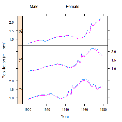
xyplot(Population ~ Year | factor(Age), USAge.df, groups = Sex, type = 'l', strip = FALSE, strip.left = TRUE, layout = c(1, 3), ylab = 'Population (millions)', auto.key = list(lines = TRUE, points = FALSE, columns = 2), subset = Age %in% c(0, 10, 20))
data(USCancerRates, package = 'latticeExtra')

xyplot(rate.male ~ rate.female | state, USCancerRates, aspect = 'iso', pch = '.', cex = 2, index.cond = function(x, y) { median(y - x, na.rm = TRUE) }, scales = list(log = 2, at = c(75, 150, 300, 600)), panel = function(...) {
  panel.grid(h = -1, v = -1)
  panel.abline(0, 1)
  panel.xyplot(...)
  },
  xlab = 'a',
  ylab = 'b')
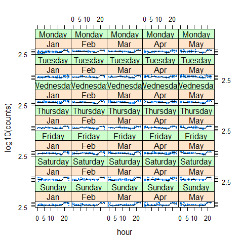
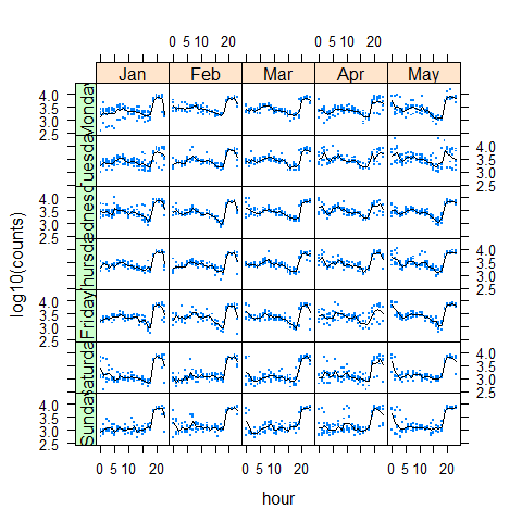
data(biocAccess, package = 'latticeExtra')

baxy <- xyplot(log10(counts) ~ hour | month + weekday, biocAccess, type = c('p', 'a'), as.table = TRUE, pch = '.', cex = 2, col.line = 'black')

baxy
library(latticeExtra)
useOuterStrips(baxy)
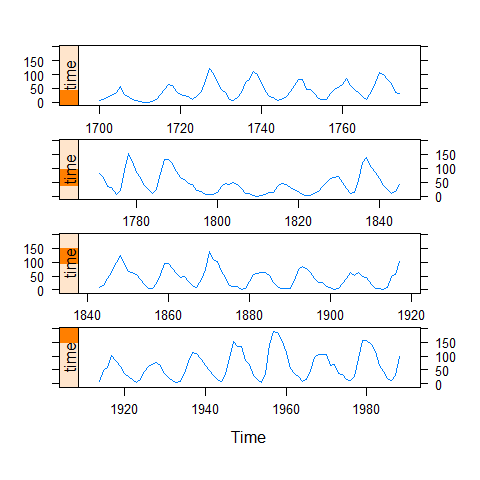
xyplot(sunspot.year, aspect = 'xy', strip = FALSE, strip.left = TRUE, cut = list(number = 4, overlap = 0.05))
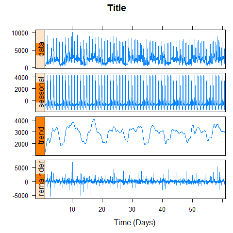
data(biocAccess, package = 'latticeExtra')

ssd <- stl(ts(biocAccess$counts[1:(24 * 30 *2)], frequency = 24), 'periodic')

xyplot(ssd, main = 'Title', xlab = 'Time (Days)')
Splom
splom(mtcars[c(1, 3, 6)], groups = cyl, data = mtcars, panel = panel.superpose, key = list(title = 'Three Cylinder Options', columns = 3, points = list(text = list(c('4 Cylinder', '6 Cylinder', '8 Cylinder')))))
trellis.par.set(superpose.symbol = list(pch = c(1,3, 22), col = 1, alpha = 0.5))
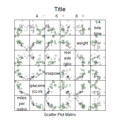
splom(~data.frame(mpg, disp, hp, drat, wt, qsec), data = mtcars, groups = cyl, pscales = 0, varnames = c('miles\nper\ngallon', 'displacement\n(cu.in(', 'horsepower', 'rear\naxle\nratio', 'weight', '1/4\nmile\ntime'), auto.key = list(columns = 3, title = 'Title'))
trellis.par.set(old.pars)
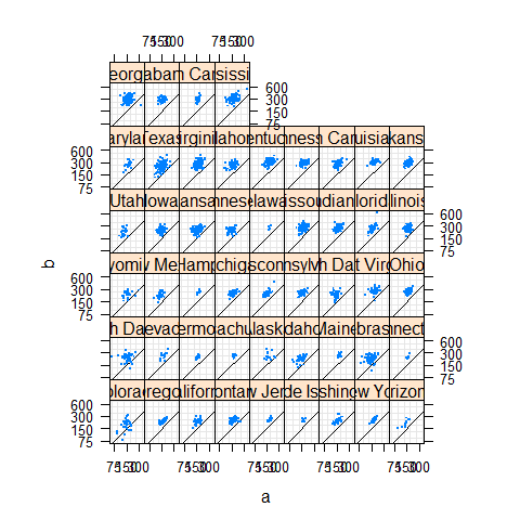
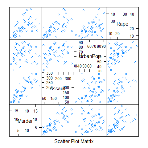
splom(USArrests)
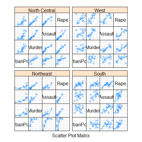
splom(~USArrests[c(3,1,2,4)] | state.region, pscales = 0, type = c('g', 'p', 'smooth'))
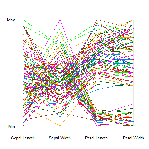
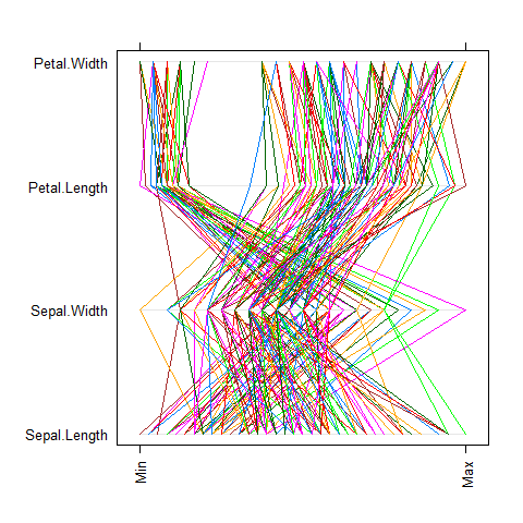
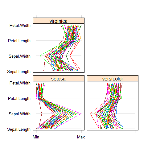
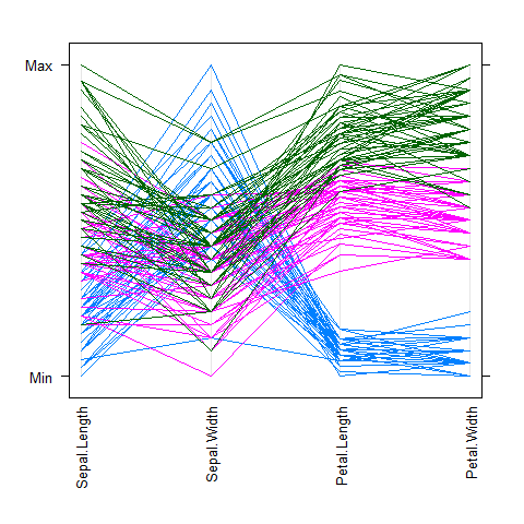
Parallel plot
For multivariate continuous data.
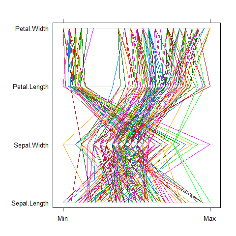
parallelplot(~iris[1:4])
parallelplot(~iris[1:4], horizontal.axis = FALSE)
parallelplot(~iris[1:4], scales = list(x = list(rot = 90)))
parallelplot(~iris[1:4] | Species, iris)
parallelplot(~iris[1:4], iris, groups = Species,
             horizontal.axis = FALSE, scales = list(x = list(rot = 90)))
Trivariate plots
Like image(), contour(), filled.contour(), persp(), symbols().
levelplot().contourplot().cloud().wireframe().
Additional Packages
The sm Package (density)
library(sm)
Density plot
# create value labels
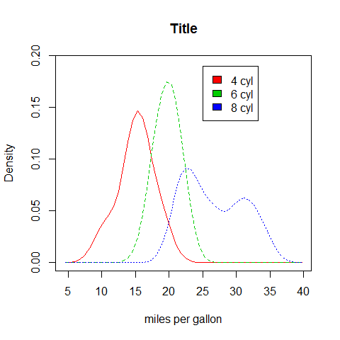
cyl.f <- factor(cyl, levels = c(4, 6, 8), labels = c('4 cyl', '6 cyl', '8 cyl'))
# plot densities
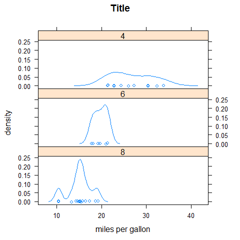
sm.density.compare(mpg, cyl, xlab = 'miles per gallon')
title(main = 'Title')
# add legend via mouse click
colfill <- c(2:(2 + length(levels(cyl.f))))
legend(25, 0.19, levels(cyl.f), fill = colfill)
The car Package (scatter)
library(car)
Scatter plot
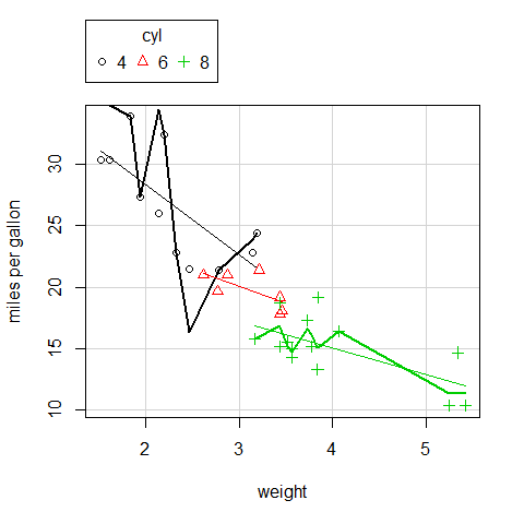
scatterplot(mpg ~ wt | cyl, data = mtcars, xlab = 'weight', ylab = 'miles per gallon', labels = row.names(mtcars))
Splom
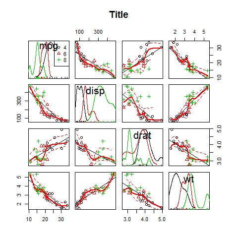
scatterplotMatrix( ~mpg + disp + drat + wt | cyl, data = mtcars, main = 'Title')

scatterplotMatrix == spm.
spm( ~mpg + disp + drat + wt | cyl, data = mtcars, main = 'Title')
The vioplot Package (boxplot)
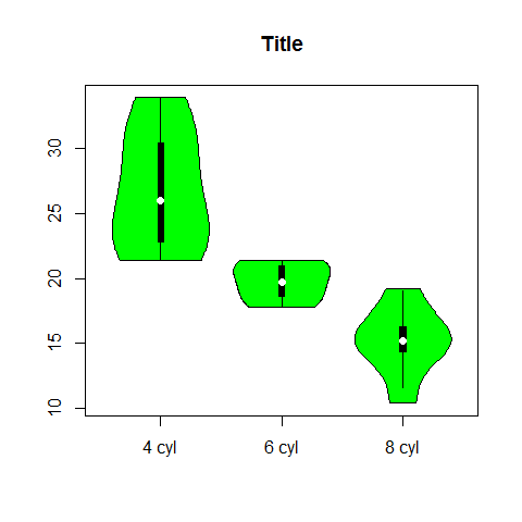
library(vioplot)
Violin boxplot
x1 <- mpg[mtcars$cyl == 4]
x2 <- mpg[mtcars$cyl == 6]
x3 <- mpg[mtcars$cyl == 8]

vioplot(x1, x2, x3, names = c('4 cyl', '6 cyl', '8 cyl'), col = 'green')

title('Title')
The vcd Package (count, correlation, mosaic)
library(vcd)
The package provides a variety of methods for visualizing multivariate categorical data.
Count
counts <- table(gear, cyl)
counts
1 2 3 4 5 | |
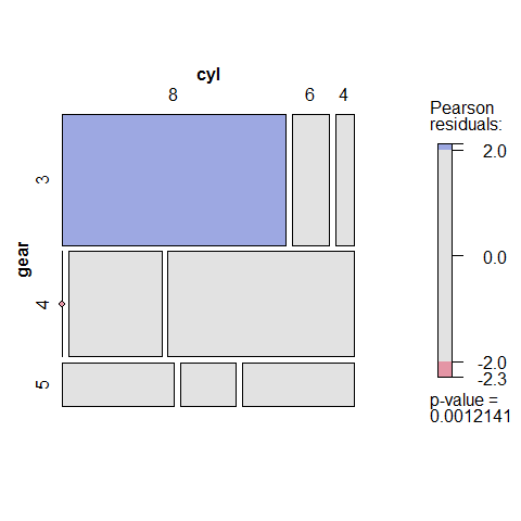
mosaic(counts, shade = TRUE, legend = TRUE)
Correlation
counts <- table(gear, cyl)
counts
1 2 3 4 5 | |
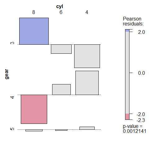
assoc(counts, shade = TRUE)
Mosaic
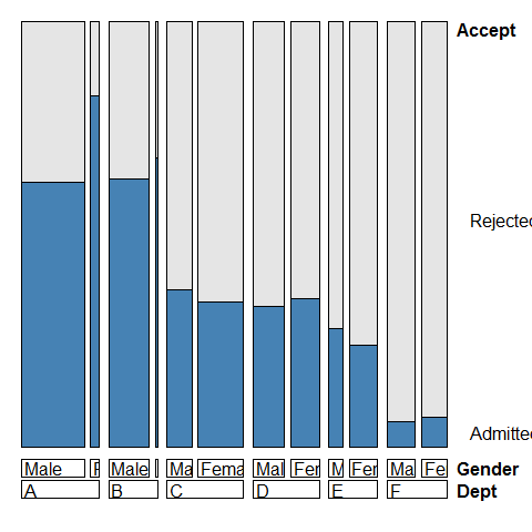
ucb <- data.frame(UCBAdmissions)
ucb <- within(ucb, Accept <- factor(Admit, levels = c('Rejected', 'Admitted')))

library(vcd); library(grid)

doubledecker(xtabs(Freq~ Dept + Gender + Accept, data = ucb), gp = gpar(fill = c('grey90', 'steelblue')))
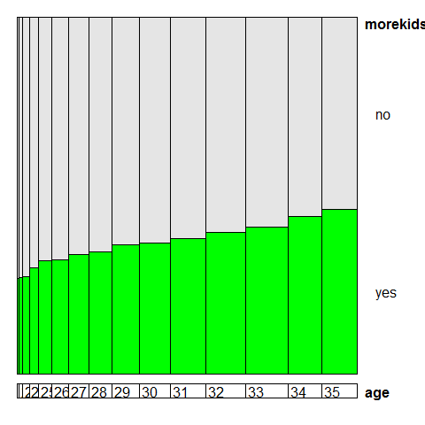
data(Fertility, package = 'AER')
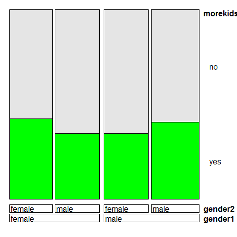
doubledecker(morekids ~ age, data = Fertility, gp = gpar(fill = c('grey90', 'green')), spacing = spacing_equal(0))
doubledecker(morekids ~ gender1 + gender2, data = Fertility, gp = gpar(fill = c('grey90', 'green')))
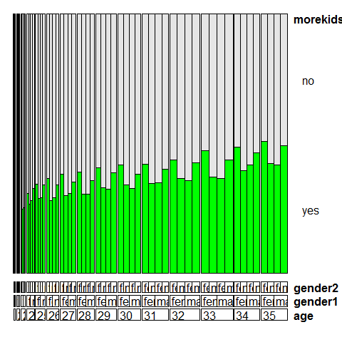
doubledecker(morekids ~ age + gender1 + gender2, data = Fertility, gp = gpar(fill = c('grey90', 'green')), spacing = spacing_dimequal(c(0.1, 0, 0, 0)))
The hexbin Package (scatter)
library(hexbin)
Scatter plot
# new data
data(NHANES)
# compare
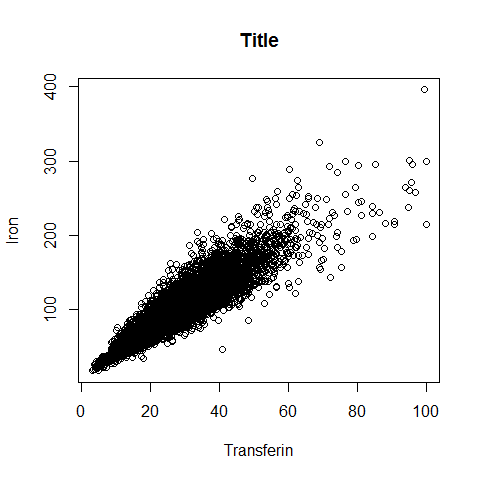
plot(Serum.Iron ~ Transferin, NHANES, main = 'Title', xlab = 'Transferin', ylab = 'Iron')
# with
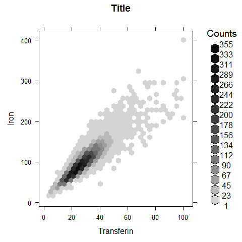
hexbinplot(Serum.Iron ~ Transferin, NHANES, main = 'Title', xlab = 'Transferin', ylab = 'Iron')
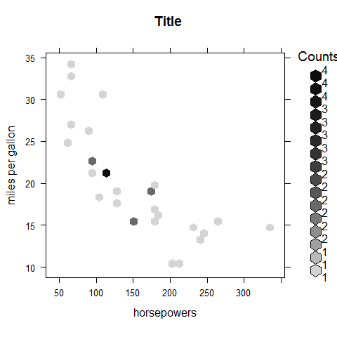
hexbinplot(mpg ~ hp, main = 'Title', xlab = 'horsepowers', ylab = 'miles per gallon')
x <- rnorm(1000)
y <- rnorm(1000)
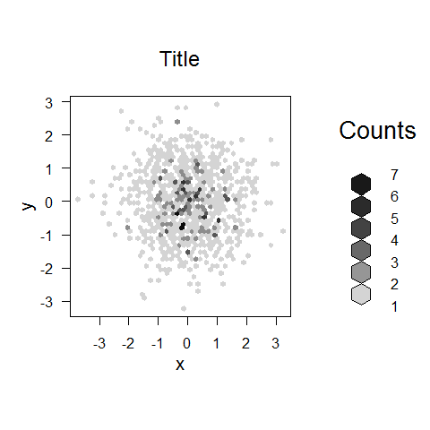
bin <- hexbin(x, y, xbins = 50)
plot(bin, main = 'Title')
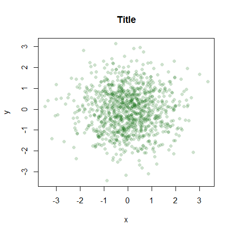
x <- rnorm(1000)
y <- rnorm(1000)

plot(x, y, main = 'Title', col =  rgb(0, 100, 0, 50, maxColorValue = 255), pch = 16)
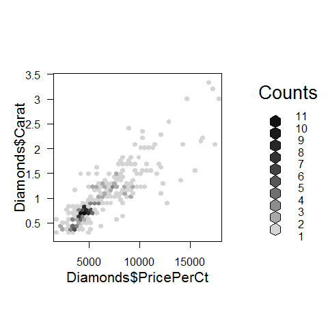
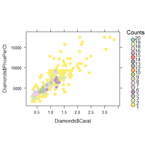
data(Diamonds, package = 'Stat2Data')

a = hexbin(Diamonds$PricePerCt, Diamonds$Carat, xbins = 40)

library(RColorBrewer)

plot(a)
Colors.
rf <- colorRampPalette(rev(brewer.pal(12, 'Set3')))

hexbinplot(Diamonds$PricePerCt ~ Diamonds$Carat, colramp = rf)
Mix lattice and hexbin
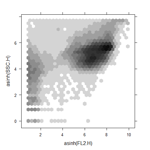
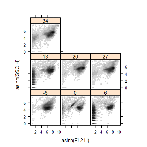
data(gvhd10, package = 'latticeExtra')

xyplot(asinh(SSC.H) ~ asinh(FL2.H), gvhd10, aspect = 1, panel = panel.hexbinplot, .aspect.ratio = 1, trans = sqrt)
xyplot(asinh(SSC.H) ~ asinh(FL2.H) | Days, gvhd10, aspect = 1, panel = panel.hexbinplot, .aspect.ratio = 1, trans =sqrt)
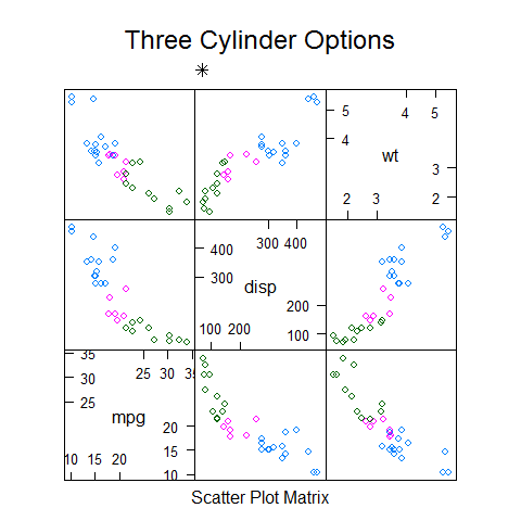
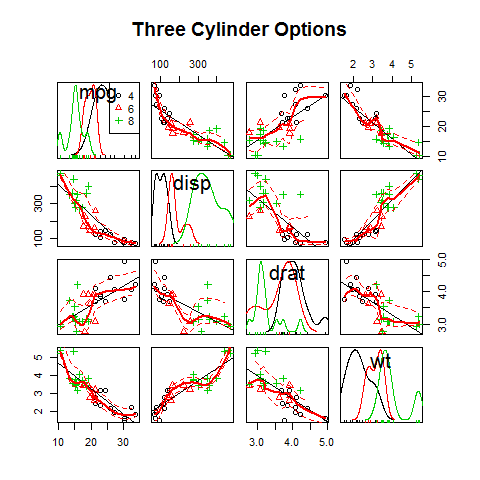
The car Package (scatter)
library(car)
Scatter plot
scatterplotMatrix(~mpg + disp + drat + wt | cyl, data = mtcars,
   main = 'Three Cylinder Options')
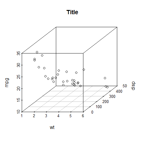
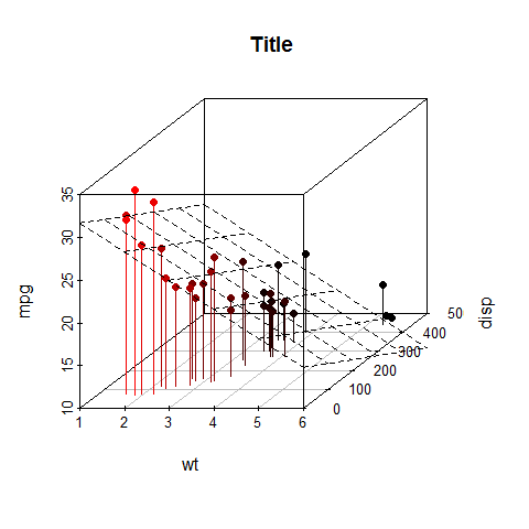
The scatterplot3d Package
library(scatterplot3d)
Scatter plot
scatterplot3d(wt, disp, mpg, main = 'Title')
scatterplot3d(wt, disp, mpg, pch = 16, highlight.3d = TRUE, type = 'h', main = 'Title')
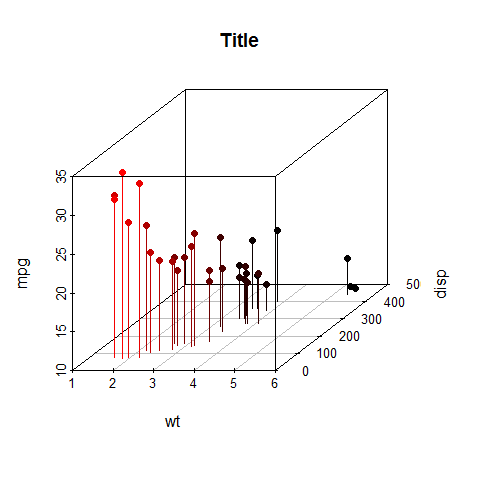
s3d <- scatterplot3d(wt, disp, mpg, pch = 16, highlight.3d = TRUE, type = 'h', main = '   Title')

fit <- lm(mpg ~ wt + disp)

s3d$plane3d(fit)
The rgl Package (interactive)
library(rgl)
Interactive plot
The plot will open a new window.
plot3d(wt, disp, mpg, col = 'red', size = 3)
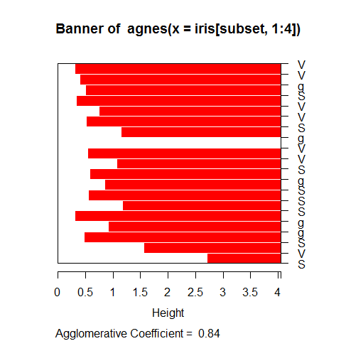
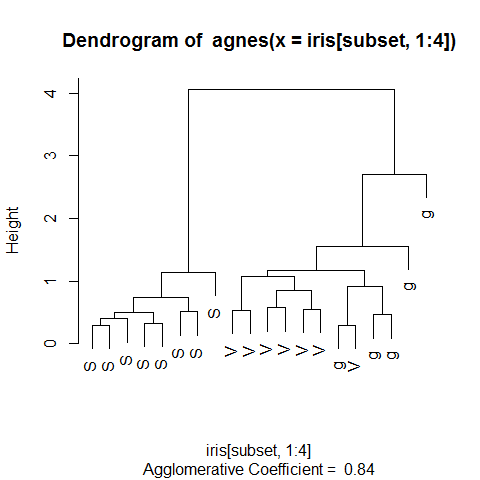
The cluster Package (dendrogram)
library(cluster)
Dendrogram
Use the iris dataset.
subset <- sample(1:150, 20)
cS <- as.character(Sp <- iris$Species[subset])
cS
1 2 3 4 | |
cS[Sp == 'setosa'] <- 'S'
cS[Sp == 'versicolor'] <- 'V'
cS[Sp == 'virginica'] <- 'g'

ai <- agnes(iris[subset, 1:4])

plot(ai, label = cS)
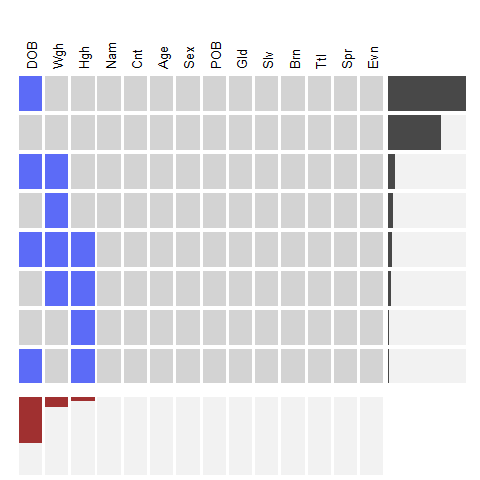
The extracat Package (splom)
library(extracat)
Splom
For missing values. Binary matrix with reordering and filtering of rows
and columns. The x-axis shows the frequency of NA. The y-axis shows the
marginal distribution of NA.
# example 1
data(CHAIN, package = 'mi')

visna(CHAIN, sort = 'b')
summary(CHAIN)
1 2 3 4 5 6 7 8 9 10 11 12 13 14 15 16 | |
# example 2
data(oly12, package = 'VGAMdata')

oly12d <- oly12[, names(oly12) != 'DOB']
oly12a <- oly12

names(oly12a) <- abbreviate(names(oly12), 3)

visna(oly12a, sort = 'b')
# example 3
data(freetrade, package = 'Amelia')

freetrade <- within(freetrade, land1 <- reorder(country, tariff, function(x) sum(is.na(x))))

fluctile(xtabs(is.na(tariff) ~ land1 + year, data = freetrade))
1 | |
# example 4
data(Pima.tr2, package = 'MASS')
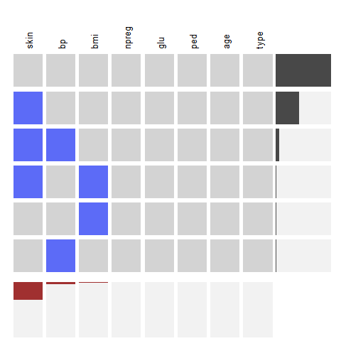
visna(Pima.tr2, sort = 'b')
The ash Package (density)
library(ash)
Density plot
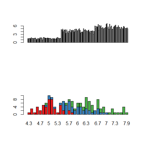
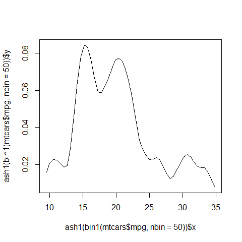
plot(ash1(bin1(mtcars$mpg, nbin = 50)), type = 'l')
1 | |
The KernSmooth Package (density)
library(KernSmooth)
Density plot
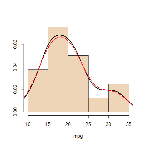
with(mtcars, {
  hist(mpg, freq = FALSE, main = '', col = 'bisque2', ylab = '')
  lines(density(mpg), lwd = 2)
  ks1 <- bkde(mpg, bandwidth = dpik(mpg))
  lines(ks1, col = 'red', lty = 5, lwd = 2)})
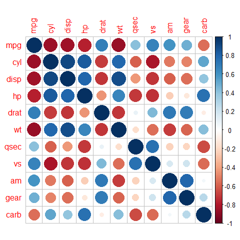
The corrplot Package (correlation)
library(corrplot)
Splom
# Create a correlation matrix for the dataset (9-14 are the '2' variables only)
correlations <- cor(mtcars)

corrplot(correlations)