googleVis
The googleVis package
The package provides an interface to Google’s chart tools, allowing users to create interactive charts based on data frames. It included maps.
The interactive maps are displayed in a browser. We can plot a complete set of interactive graphs and embed them into a web page.
Some motion charts cannot be displays in tablets and mobile phones (using HTML5) because they are rendered with Flash; Flash has to be installed on a PC.
- Examples.
- Charts: line, bar, column, area, stepped area, combo, scatter, bubble, customizing, candlestick (or boxplot), pie, gauge, annotation, Sankey, histogram, and motion (GapMinder-like)
- Maps: intensity, geo, choropleth, marker, Google Maps.
- Table, organizational chart, tree map, calendar, timeline, merging.
- Motion charts and some maps only work in Flash, not in HTML5 as with tablets and mobile phones).
- Gallery.
- Documentation.
- As above.
- Introduction.
- Roles.
- Trendlines.
- Markdown.
- In R, run a demo with
demo(googleVis).
Always cite the package:
citation("googleVis")##
## To cite the googleVis package in publications use:
##
## Markus Gesmann and Diego de Castillo. Using the Google Visualisation
## API with R. The R Journal, 3(2):40-44, December 2011.
##
## Une entrée BibTeX pour les utilisateurs LaTeX est
##
## @Article{,
## title = {googleVis: Interface between R and the Google Visualisation API},
## author = {Markus Gesmann and Diego {de Castillo}},
## journal = {The R Journal},
## year = {2011},
## volume = {3},
## number = {2},
## pages = {40--44},
## month = {December},
## url = {https://journal.r-project.org/archive/2011-2/RJournal_2011-2_Gesmann+de~Castillo.pdf},
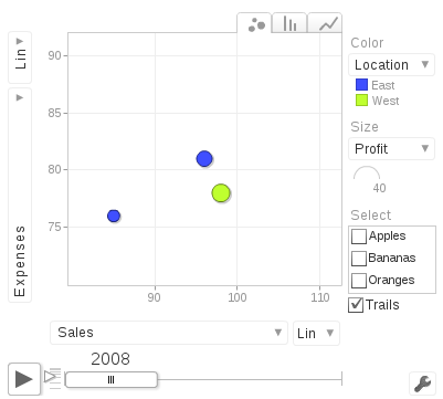
## }Here is an example (converted in png) of the gvisMotionChart.
suppressPackageStartupMessages(library(googleVis))

M <- gvisMotionChart(Fruits,
                     idvar='Fruit',
                     timevar='Year',
                     options=list(width=400, height=350))

plot(M)
The results as an image:
The problem with googleVis motion chart is they only work with Flash players; PC browsers with Flash can render motion charts. Tablets and mobiles phones only render HTML5.
The next charts and maps are made of HTML, CSS, JavaScript.
Geo <- gvisGeoChart(Exports,
                    locationvar="Country",
                    colorvar="Profit",
                    sizevar="", # size of markers
                    hovervar="", # text
                    options=list(projection="kavrayskiy-vii"))

plot(Geo)
We can even edit the results in the browser!
Editor <- gvisGeoChart(Exports,
                       locationvar="Country",
                       colorvar="Profit",
                       options=list(gvis.editor='Edit me!'))

Plot(Editor)
Geo2 <- gvisGeoChart(CityPopularity,
locationvar='City',
colorvar='Popularity',
options=list(region='US',
height=350,
displayMode='markers',
colorAxis="{values:[200,400,600,800], colors:[\'red', \'pink\', \'orange',\'green']}"))
Plot(Geo2)CityPopularity3 <- data.frame(City = c('Montreal', 'Toronto'),
Popularity = c(700, 200))
Geo3 <- gvisGeoChart(CityPopularity3,
locationvar='City',
colorvar='Popularity',
options=list(region = 'CA',
height=350,
displayMode='markers',
colorAxis="{values:[200,400,600,800], colors:[\'red', \'pink\', \'orange',\'green']}"))
Plot(Geo3)PopTable <- gvisTable(Population,
formats=list(Population="#,###",
'% of World Population'='#.#%'),
options=list(page='enable'))
Plot(PopTable)G <- gvisGeoChart(Exports,
locationvar="Country",
colorvar="Profit",
options=list(width=300, height=200))
T <- gvisTable(Exports,
options=list(width=300, height=370))
GT <- gvisMerge(G, T, horizontal=FALSE)
Plot(GT)